Year in review: top 10 furniture launches of 2022, selected by Wallpaper* design editor Rosa Bertoli
Top 10 furniture launches of 2022, as picked by Wallpaper’s Rosa Bertoli, from office furniture to sustainable initiatives and new collaborations
- (opens in new tab)
- (opens in new tab)
- (opens in new tab)
- Sign up to our newsletter Newsletter
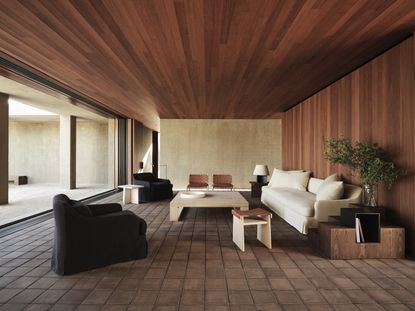
Wallpaper* design editor Rosa Bertoli selects her top 10 furniture launches of 2022, a year packed with design weeks, fairs and events. From brand launches to new collaborations, from the office to the outdoors, we highlight the colourful, the clever and the classic. Scroll down for the year’s best furniture debuts (in no particular order).
TOP 10 FURNITURE LAUNCHES OF 2022
01. OMA’s office furniture for UniFor
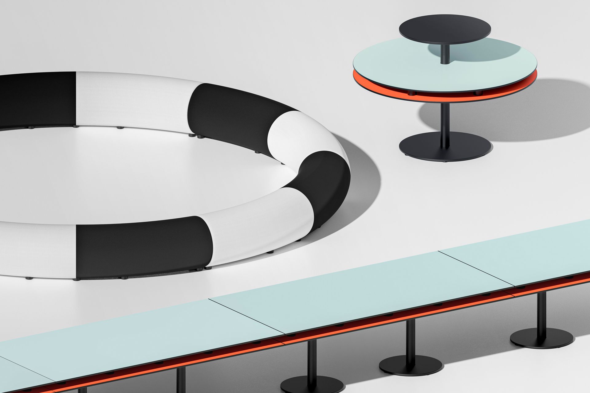
In 2014, German publishing behemoth Axel Springer selected OMA to design its new Berlin HQ, with a view to creating working environments that ‘support the cultural transformation towards a digital publishing house’. The custom furnishings for the project, produced by Italian office furniture specialist UniFor (part of Molteni Group) consider new methods of collaborative work, taking into account different team sizes and uses of space, and devised a multilevel open-plan set-up, with dynamic clusters of desks and breakout areas with partitions, sofas and workstations. The collection is an evolution of OMA’s work on the more informal areas of the Axel Springer Campus. It consists of over 100 elements divided by size and typology, which lend themselves to many configurations. Among the key pieces, explains Barone, are the ‘Tables’, ranging in size from 0.1 to six sq m and defined by a double-deck tabletop.
02. Zara Home by Vincent Van Duysen
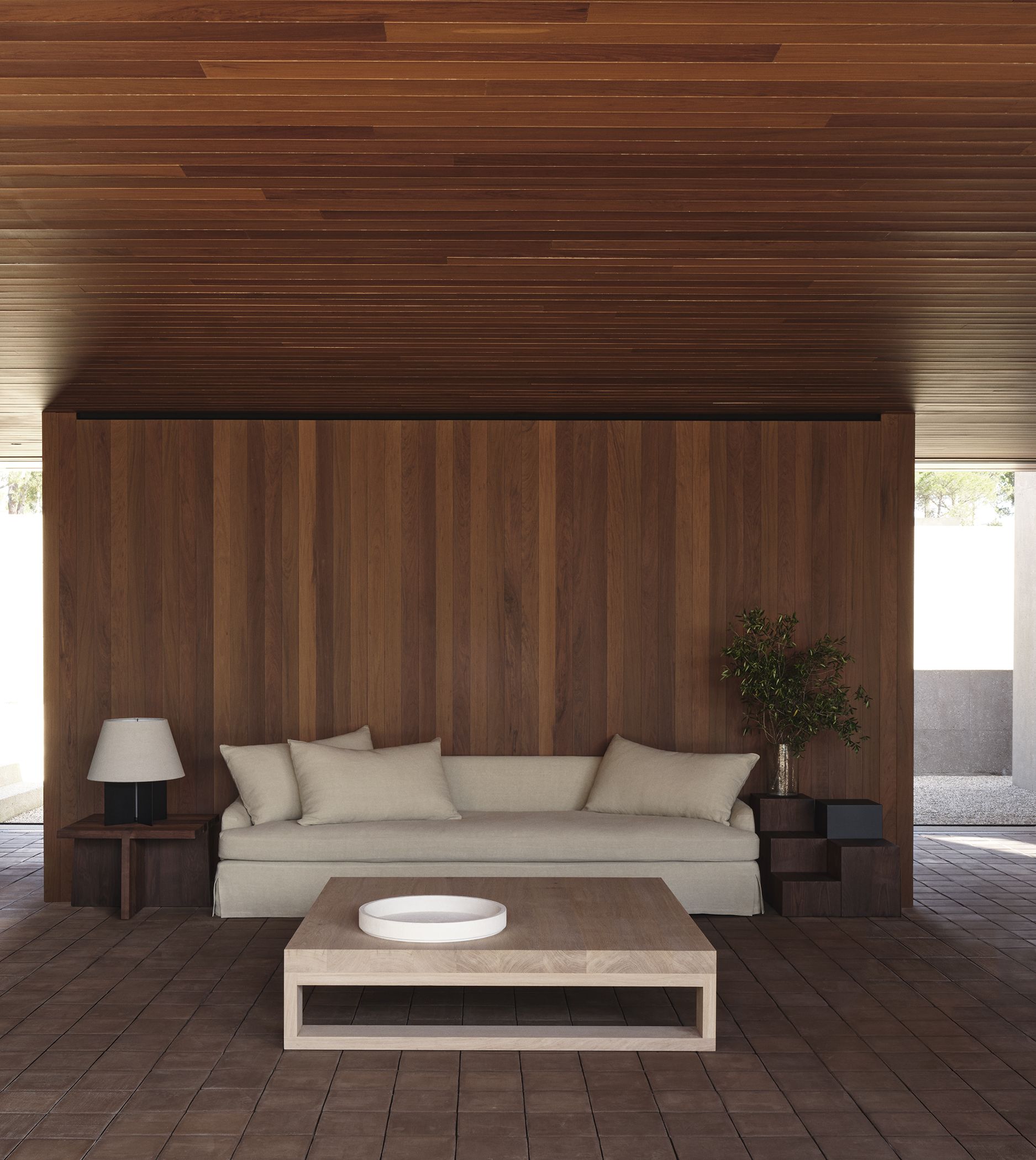
In 2022, Zara Home announced a new collaboration with Vincent Van Duysen, featuring furniture and home accessories in the distinctive sophisticated style of the Belgian architect. The first of a series of collaborative pieces (part of an ongoing collection scheduled to be updated with new designs twice a year) focused on the living room, with sofas, armchairs, tables, desks and consoles, as well as lighting, ceramics and textiles. 'I looked back and seriously reflected on my past works,' said Van Duysen. This first collection is inspired by the evolution of Van Duysen’s own Antwerp homes: his living room in the 1980s, when he had just moved back to Belgium from Milan, and his space now. Some subtle, distinctive motifs define these spaces, and they recur in the collection: purity of lines, geometries, natural materials including wood, stone and linen and a palette of neutral colours (bone, midnight blue, dark green) that give a peaceful and meditative tone to the environments.
03. Paola Lenti and Estudio Campana seating
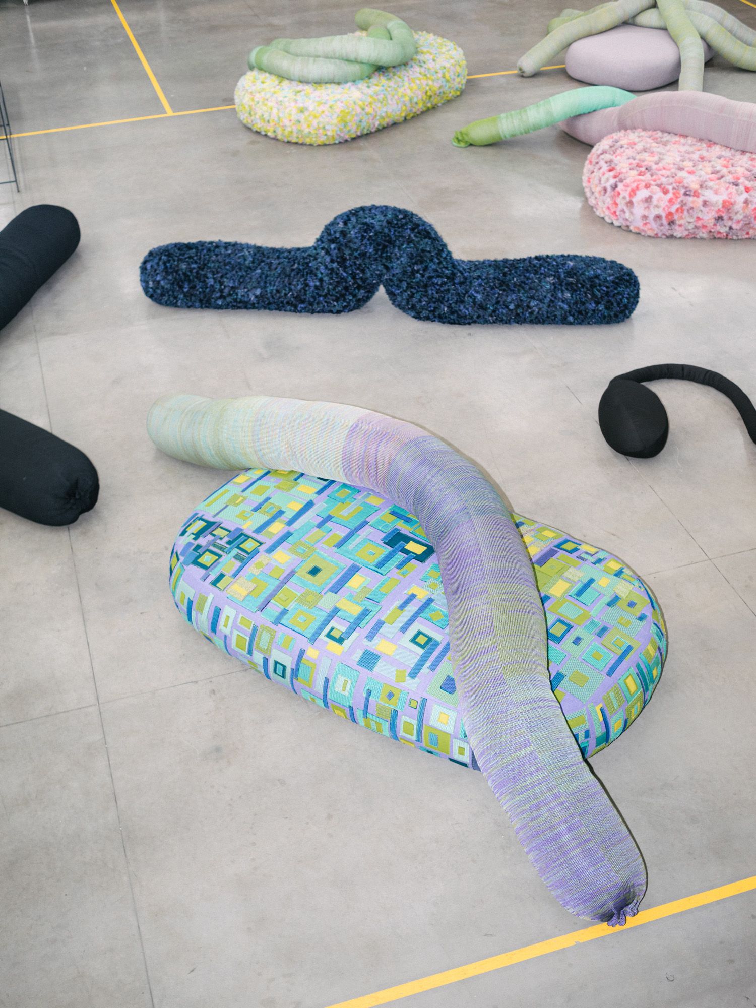
‘Working on this project has been a gift for us,’ said designers Humberto and Fernando Campana of their new collaboration with the Italian company Paola Lenti. Entitled ‘Metamorphosis’, to suggest the transformation of materials in the hands of the designers, this collection and aims to raise awareness of the future of sustainable productions, and the beauty of materials with past lives. The seating series, developed by the Brazilians in close collaboration with the company, are made of waste pieces of carpet or textile, now ready for a new life. The brand’s eponymous founder, Paola Lenti, sent a huge box full of small fragments of colourful fabrics to Brazil. The Campanas called it a ‘treasure’, able to generate endless outcomes. ‘What could a simple piece of rope be turned into? A flower? A seaweed? What could a fragment of fabric become? How could we play with colours?’ wondered Lenti. Inspired by nature and named after various types of insects, the resulting collection transforms unwanted materials into one-off pieces that take on organic forms; each handmade piece is slightly different, depending on ‘the catch of the day’.
04. Holloway Li’s debut furniture collection with Uma
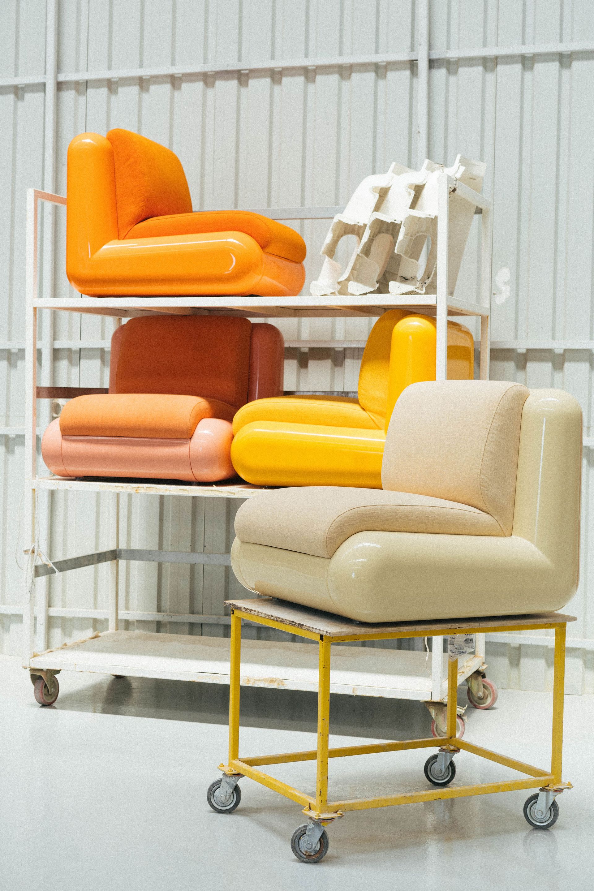
Inspired by the optimism of the 1990s, the ‘T4’ collection by London-based architecture practice Holloway Li in collaboration with Turkish manufacturer Uma features candy hues and a playful design. The collection also marks the furniture debut for the practice, led by interior architects Alex Holloway and Na Li. Cool Britannia and 1990s design icons such as inflatable chairs and lava lamps, as well as TV references (think Big Brother’s Diary Room or ‘the golden era of the chat show sofa’) form the basis for the collection which, the architects explain, ‘is an homage to the visual language of colourful onscreen scenography that dominated before the turn of the millenium.’
05. ‘Frankly Yours’ by India Mahdavi for Svenkst Tenn
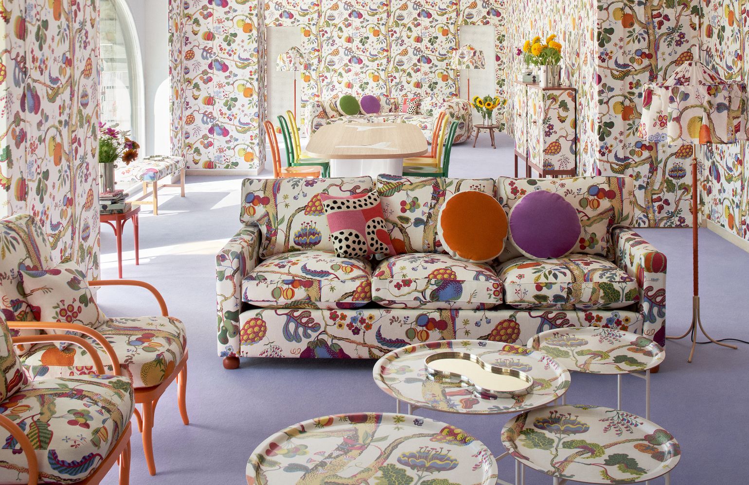
Designer India Mahdavi staged a takeover of Svenskt Tenn’s gallery space on the occasion of Stockholm Design Week 2022. The starting point for the space is Frank’s ‘Vegetable Tree’ print, a multicoloured composition of fruits and flowers on white textile cladding the room’s walls in their entirety. ‘The “Vegetable Tree” print brings us back to the root of life: nature in its purest form,’ comments Mahdavi. The project was titled ‘Frankly Yours’ and saw the Parisian designer experimenting with the legacy of the brand, using iconic prints and objects, as well as new pewter pieces and a lamp designed for the occasion. The pewter trays, Mahdavi explains, are a tribute to Svenskt Tenn’s founder, Estrid Ericson. ‘At the age of 30, back in 1924, she was already such an example for women: a strong and independent entrepreneur,’ says Mahdavi. ‘The whole project honours the history, the origins and the work made by Svenskt Tenn, Estrid Ericson and Josef Frank.’
06. Kwangho Lee and Hem collaboration
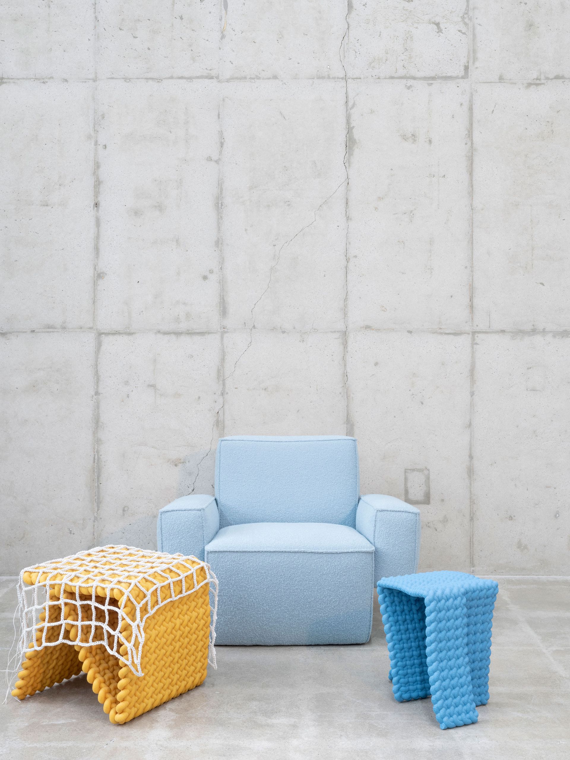
Korean designer Kwangho Lee's ongoing knotted series caught the attention of Petrus Palmér, founder of Hem: ‘I found Kwangho’s woven ropework fascinating for its obsessive nature, the pop culture references and the bright colours,’ he says. He commissioned Lee to create new pieces for the brand, and the resulting collection marks the first time the designer’s visual language is translated for large-scale production and available to a wider audience. For Hem, Lee created a lounge chair whose design stems from one of the knotted ‘Obsession’ pieces: angular and bulky, the ‘Hunk’ chair is defined by four blocks in an archetypal armchair form, a natural progression of the simple knotted designs that inspired the piece. Available with or without armrests, the chair is accompanied by a series of tables, made of folded and bent metal and developed from ‘New Armor’, a 2013 collection of lacquered bronze furniture inspired by the body armour used in Korea’s Joseon dynasty (1392-1910).
07. New brand Koyori
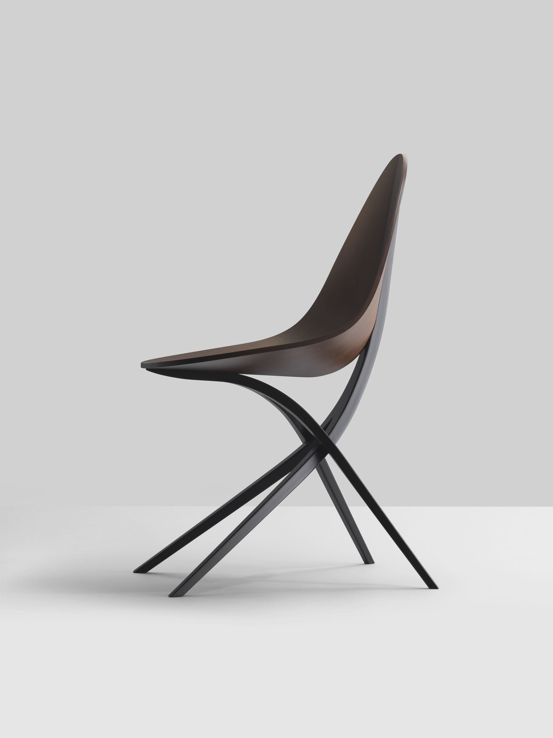
‘Edaha’ chair by GamFratesi
New furniture brand Koyori filters Japanese aesthetics through the prism of borderless contemporary design, brought to life through the skill of notable Japanese manufacturers. Authentic, crafted and diligent are three key words that define Koyori, according to Munetoshi Koda, its executive director and a furniture industry veteran: ‘By collaborating with contemporary designers from across the globe, we aim to deliver furniture of reliable quality and interior accessories that are elegant, with designs that transcend borders.’ The brand launched with a series of chair designs by Ronan and Erwan Bouroullec and Gam Fratesi.
08. Almendra by Patricia Urquiola for Flos
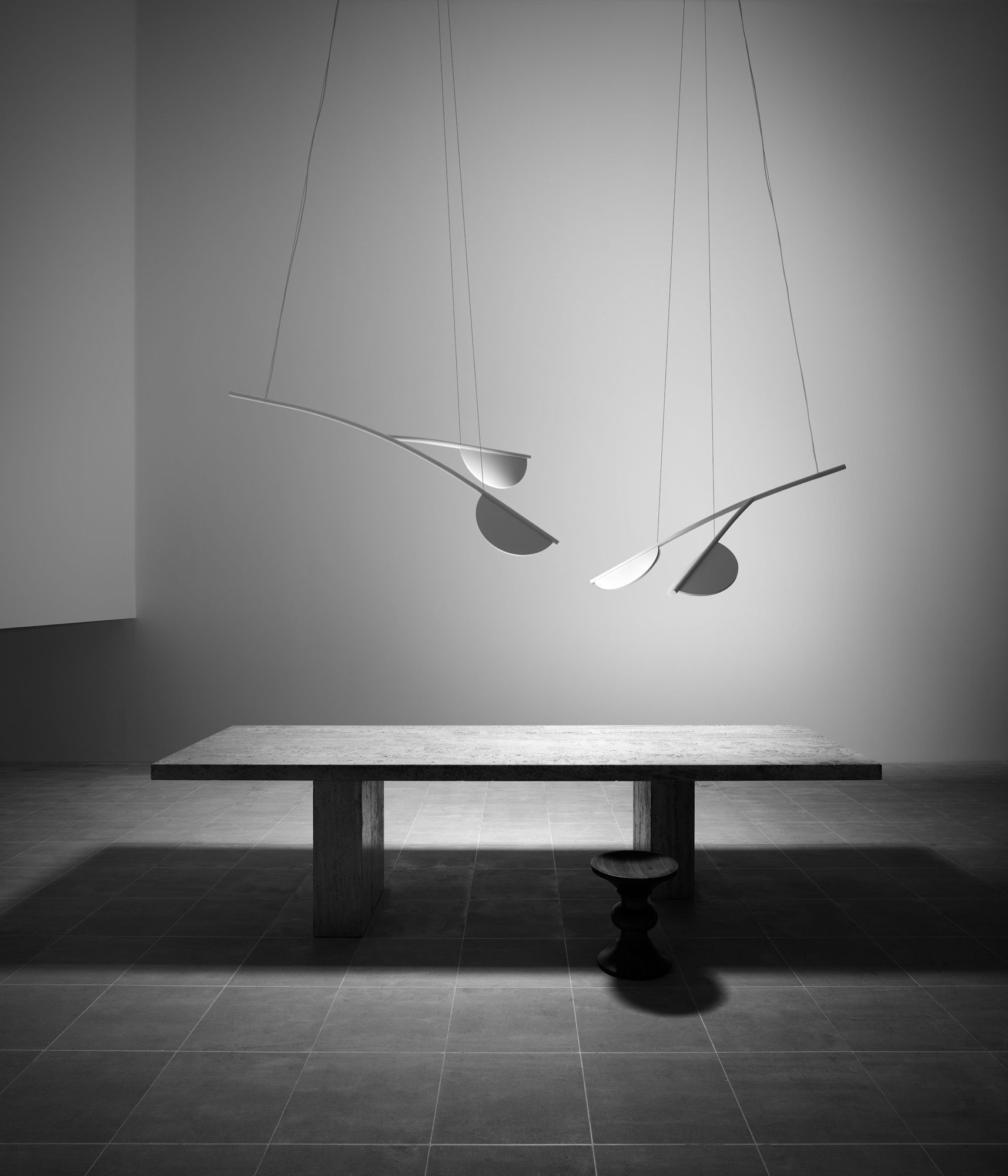
Patricia Urquiola's latest creation for Flos is a sustainable lighting system featuring organic shapes inspired by the fruit and flowers of almond trees. ‘In terms of form, ‘Almendra’ is a very simple piece,’ says Urquiola. ‘But you can organise it in many different ways. Either in a linear composition, which is more severe yet simpler, or you can use the parabolic-shaped pieces to make it feel more organic.’ She envisions ‘Almendra’ as a versatile spatial centrepiece, hanging either as a singular piece or in complex compositions in both domestic landscapes and public spaces: ‘It takes the place of what, in the past, would have been a chandelier.’ According to Urquiola, the name ‘Almendra’, meaning almond in her native Spanish, is a reference to the seed of its namesake’s flowering tree, which inspired the lights’ ovoid shape. She reckons this can be traced back to childhood visits to Ibiza with her family where, each winter, orchards full of the spindly fruit trees burst into blossoming pink-tinged clouds. ‘Nature is just the best example of modularity,’ she says.
09. Hans Bølling furniture with Brdr Krüger and AHEC
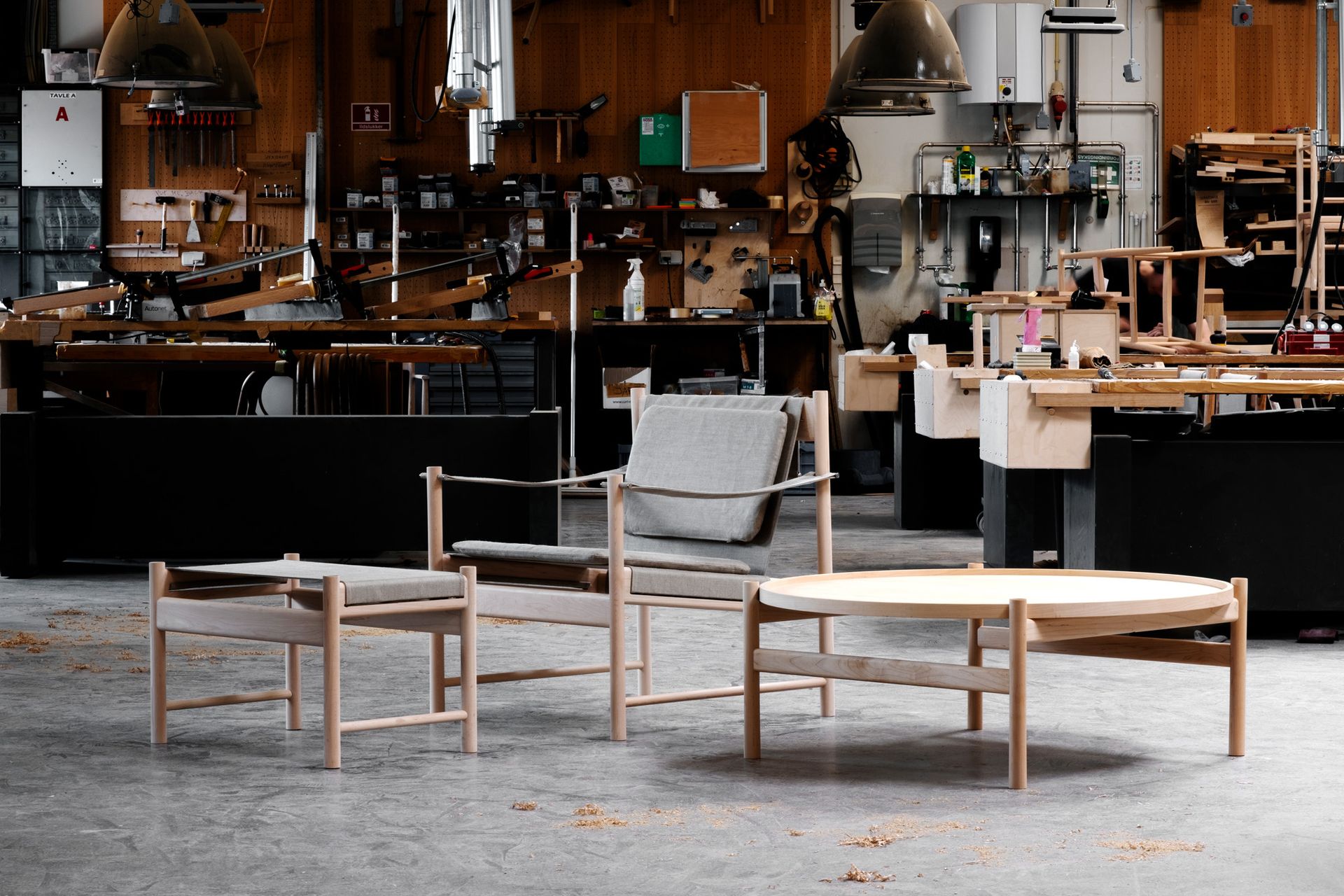
While nonagenarian Danish architect and designer Hans Bølling’s output has included major architectural projects such as a Japanese boarding school in south Denmark, these days he devotes his time to the furniture projects that had once been a mere hobby. His latest pieces: a lounge chair (his first), a stool and a coffee table, all created in collaboration with Danish furniture label Brdr Krüger, which were launched with an exhibition, ‘House of Hans Bølling’, at the brand’s Copenhagen showroom during 3 Days of Design 2022.
10. Fendi Casa’s new furniture collection
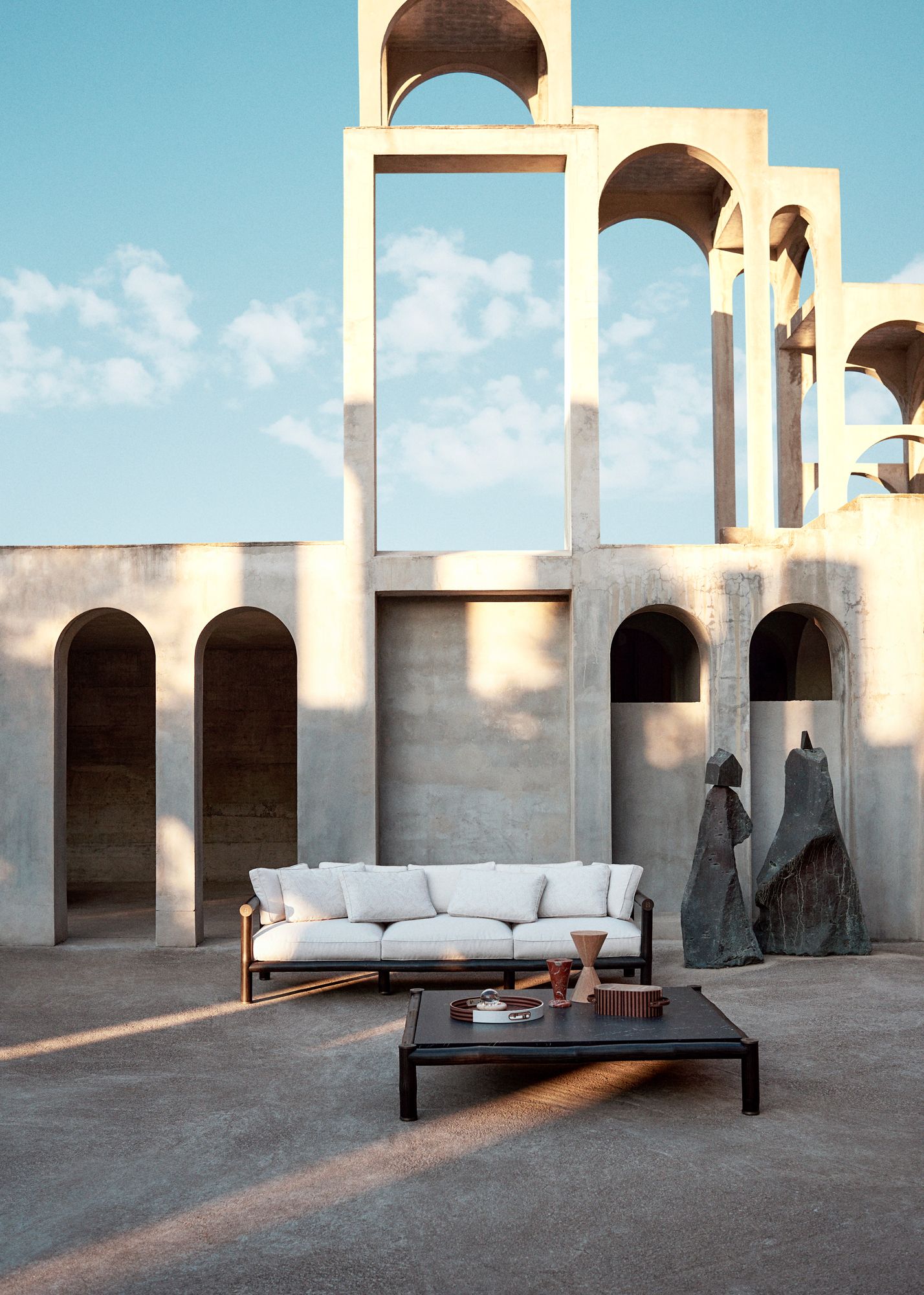
The ‘Sagano’ sofa and coffee table, designed by Piero Lissoni
Fendi Casa unveiled its latest collection of furniture, created in collaboration with a roster of global creatives. Orchestrated by the maison’s artistic director of menswear and accessories, Silvia Venturini Fendi, the collection features contributions from leading designers such as Piero Lissoni, Atelier Oï, Dimorestudio, Marcel Wanders Studio, and Cristina Celestino and Chiara Andreatti. The collection is an evolution that fully represents the brand’s commitment to design: ‘It features cutting-edge designs; it’s more eclectic and in line with our collections for men and women, who I would imagine living in these new spaces,’ explains Venturini Fendi. ‘Everything is very organic and aligned with our DNA.’ To mark its launch, the collection was photographed at the estate of Catalan sculptor Xavier Corberó, whose concrete arches form a backdrop for the collection’s rich textures.
Rosa Bertoli was born in Udine, Italy, and now lives in London. Since 2014, she has been the Design Editor of Wallpaper*, where she oversees design content for the print and online editions, as well as special editorial projects. Through her role at Wallpaper*, she has written extensively about all areas of design. Rosa has been speaker and moderator for various design talks and conferences including London Craft Week, Maison & Objet, The Italian Cultural Institute (London), Clippings, Zaha Hadid Design, Kartell and Frieze Art Fair. Rosa has been on judging panels for the Chart Architecture Award, the Dutch Design Awards and the DesignGuild Marks. She has written for numerous English and Italian language publications, and worked as a content and communication consultant for fashion and design brands.
-
 These artists are putting their stamp on the ‘Lady Dior’ handbag
Now in its seventh edition, ‘Dior Lady Art‘ invites international artists to reimagine Dior’s Lady Dior handbag – one of the house’s most memorable styles
By Jack Moss • Published
-
 Watch Ryuichi Sakamoto's mesmerising musical experience at the Brooklyn Museum
An iconic composer who traverses popular and high culture, Ryuichi Sakamoto pushes music into new frontiers, most recently in ‘Seeing Sound, Hearing Krug’, a new composition that pairs sound, flavour, light and texture
By David Graver • Published
-
 Last chance to see: ‘Strange Clay’ at The Hayward Gallery, London
At London’s Hayward Gallery, group show ‘Strange Clay: Ceramics in Contemporary Art’ sees ceramic artists explore the physical, psychological, political and power of their medium
By Emily Steer • Published


