The Oslo National Museum offers ‘low-key monumentality’
Architect Klaus Schuwerk completes the Oslo National Museum, which prepares to open its doors to the public this weekend
- (opens in new tab)
- (opens in new tab)
- (opens in new tab)
- Sign up to our newsletter Newsletter
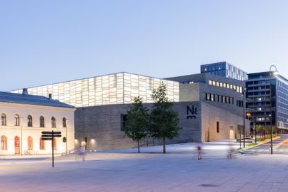
The new Oslo National Museum is the latest mega project to open along the Norwegian capital's increasingly buzzing waterfront in the past couple of years. However, unlike its most recent predecessor, the kookily slanted-at-the-top Munch museum, its arrival and presence is more muted. And this despite its whopping 54,600 sq m size and impressive £510m price tag. Composed of a low-slung structure that gets taller as it moves away from the harbour in line with the surrounding streetscape, it is topped by a translucent volume to the fore and a darker volume behind it. At the front it joins up with two existing 19th-century former railway buildings (one of which is now the Nobel Peace Prize museum), forming a new piazza that leads to the entrance foyer. It is at once a monumental and encyclopaedic museum for the 21st century, bringing together the collections of five existing city institutions dedicated to art, architecture and design – yet it is somehow also modest and minimal.
Lead architect Naples-based Klaus Schuwerk (who won the competition with Berlin office Kleihues + Kleihues), credits the city he lives in, a place where there is no fake architecture, he says, and his architectural forefathers over thousands of years for the building’s design. In particular, he cites Leon Battista Alberti, Karl Friedrich Schinkel and Mies van der Rohe, without which this building would have been ‘unthinkable'. A Norwegian newspaper coined the term ‘low-key monumentality’ in relation to the project and Schuwerk liked this definition because, for him, monumentality is not about something being ‘gigantic' but about something ‘that will remain for a long time', something that has meaning and presence.

A lot of the building’s allure and appeal is in fact its aura of calm and solidity in an urban area characterised by visual and architectural diversity and some messiness. The choice of an often local, sometimes noble, and always durable palette of materials plays an important role. A southern German shell limestone was selected for the floors of the public areas, while oak boards are used in the exhibition rooms. Elsewhere, marble can be seen around the windows in the exhibition areas and the windows and oak doors have bronze casings and door handles and fittings respectively. The real material protagonist, or ‘player' as Schuwerk puts it, is a decorative slate from Oppdal in central Norway that was chosen for the façade and vestibule cladding. ‘This stone is what most of Norway is made of but you don’t see it look like this,' says Schuwerk. ‘Usually, it's cut horizontally and then it's a bit cloudy but we cut it vertically across the grain so you see all these layers inside the stone. Within each layer, there are millions of years of Norwegian history.'
Internally the exhibition rooms feature wooden floors and light-filled ceilings, while the central foyers or atriums on each floor have stone floors and textile ceilings. There are tantalising framed views through the galleries, into internal courtyards that contain sculptural works, or up long and elegant staircases, that provide a visual rest and change of pace, a necessity in a building with some 90 rooms, or 13,000 sq m, dedicated to permanent and temporary exhibitions. As well as a publicly accessible art library, two cafés, a fairly discreet yet large museum shop, an auditorium and several meeting rooms, the building, unusually for a city centre museum, also manages to house conservation studios, a photography studio and storage space for most of the museum’s 400,000-plus collection of objects.

The top floor contains the Light Hall, a 133m-long space with walls made of marble glass (thin sheets of Portuguese marble laminated between two sheets of glass) that will be used for temporary exhibitions and sits atop a plinth of grey slate. With the 7m-high ceilings, the atmosphere here is uplifting and luminescent in the daytime, and beacon-like at night, when 9,000 LED diodes highlight its veined patterns to great effect. Perhaps surprisingly, no art can be hung on the walls here, but it is a space that could accommodate dramatic large-scale sculptures or site-specific installations in a way few other venues can and it leads onto an expansive roof terrace that can accommodate more art and events.

It’s no secret that the architect and museum have had a difficult relationship at times, partly due to the former’s uncompromising approach, and that construction delays and escalating costs have also caused controversy. Schuwerk has asked for a clarification to be published on the museum’s website about aspects of the project he says he didn’t author. It’s mainly things like the wayfinding and signage (inside and out), the benches in the exhibition areas, the digital monitors in the entrance foyer and a lot of the furniture, which he feels don’t fit with the architectural vision. He objects to the first-floor café too, saying this was a last-minute addition and there is a proper restaurant space downstairs. There has been some bemusement about his stance, as these things appear fairly small fry to many.
Yet despite all the ‘noise’ around the project’s inception, the core idea and tone of the building are intact, inside and out. It’s a credit to both the architect’s determination regarding certain material and design choices (the sumptuous marble-clad toilets on the lower-ground floor are a good example of his perseverance), and the museum’s willingness to see it through, that this is the case. Most importantly, however, this is a building that feels comfortable and even inspiring to be in, and solid enough that it should still be here in hundreds of years’ time.


INFORMATION
kleihues.com (opens in new tab)
-
 Sapir Bachar’s love for silver makes for abstract jewellery forms
Sapir Bachar’s fashion background informs her eponymous jewellery brand
By Pei-Ru Keh • Published
-
 Spectacular Wyoming ranch sits within a restored working landscape
This Wyoming ranch by CLB Architects offers a new approach to the Western architectural tradition, combining daring and functional modern design with a welcoming character
By Jonathan Bell • Published
-
 Last chance to see: Cyprien Gaillard on chaos, reorder and excavating a Paris in flux
We interviewed French artist Cyprien Gaillard ahead of his major two-part show, ‘Humpty \ Dumpty’ at Palais de Tokyo and Lafayette Anticipations (until 8 January 2023). Through abandoned clocks, love locks and asbestos, he dissects the human obsession with structural restoration
By Harriet Lloyd-Smith • Published
-
 Sydney Modern opens its doors and reveals immersive SANAA architecture
SANAA’s Sydney Modern opens its doors to the public in Australia
By Ellie Stathaki • Published
-
 Refreshed Gainsborough House in Suffolk gears up for reopening
Thomas Gainsborough House in Suffolk reopens to a design by architecture studio ZMMA
By Ellie Stathaki • Published
-
 Etruscan Galleries at Fondazione Luigi Rovati by Mario Cucinella just flow
In Milan, the Etruscan Galleries at the Fondazione Luigi Rovati, designed by architect Mario Cucinella, open to the public
By Ellie Stathaki • Last updated
-
 Nordic architecture explored in Share, a book about contemporary building
Discussions about Nordic architecture and contemporary practice meet in a new book by Artifice, Share: Conversations about Contemporary Architecture – The Nordic Countries
By Ellie Stathaki • Published
-
 Morphosis unveils flowing Orange County Museum of Art
Explore the curved shapes and expressive interiors of the Orange County Museum of Art by Morphosis, now open in California
By Ellie Stathaki • Last updated
-
 Buffalo AKG Art Museum by OMA looks to the future
The Buffalo AKG Art Museum (formerly the Albright-Knox Art Gallery) is reborn with a striking OMA-designed extension, site-specific installations, and a new focus on the local community
By Amy Serafin • Last updated
-
 Estudio MMX’s Geology Museum on the Yucatán Peninsula is a big hit
Estudio MMX’s new crater-inspired Geology Museum on the Yucatán Peninsula is sure to be a big hit
By Ellie Stathaki • Last updated
-
 A Norwegian coastal cabin provides a platform for spectacular views
Architect Tommie Wilhelmsen turns constraints into elegance at this new cabin on the Norwegian coast
By Jonathan Bell • Last updated
