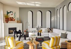
Office design: the latest trends in workspace architecture
Whether we are currently in the office or not, corporate identity is expressed through workspace design. For your home office, draw inspiration from the latest design trends and evolving ideas across the realm of office design. Work it.
- (opens in new tab)
- (opens in new tab)
- (opens in new tab)
- Sign up to our newsletter Newsletter
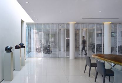
Dongfeng Park 3# Yard, Beijing, China
Beijing China Virtue Architectural Design
This new workspace between the East 4th-5th Ring Road of Beijing City aims to provide for its users with both a space to work in and also relax and feel close to nature. Sitting in the city's outskirts, near the green belt, the project is a low volume with generous flowing interior spaces wrapped in sweathes of glass that lead the eye to outdoor courtyards and greenery beyond. ‘By placing more attention to designer's work condition, physical and mental health, the project hopes to build up to be the most popular office for designers,' say the architects, the local practice Beijing China Virtue Architectural Design.
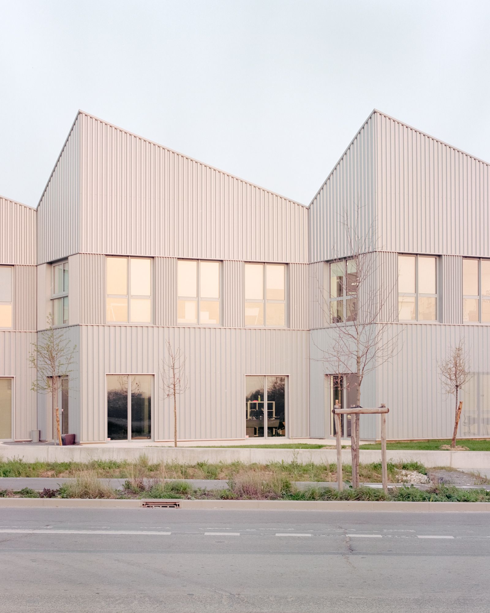
Urban Valey, Massy, France
ateliers o-s architectes
This office building in Massy, just south of Paris, sits within a business park, forming an intergral part of the area's built environment. The architects created a form that feels minimalist but also intricate enough to hint at the surrounding landscape, featuring a series of pitched roofs and a striated skin that adds depth and nuance to the, otherwise fairly simple, utilitarian facade. The design makes it eye catching but also functional, as its flexible interior and different sections can be divided up for the use of different clients if needed. ‘The general image of the project is that of a toolbox, a technological and functional tool that marks the dynamism of the city of Massy, with a concern for architectural, urban and landscape quality while offering an evolving technical device,' say the architects.
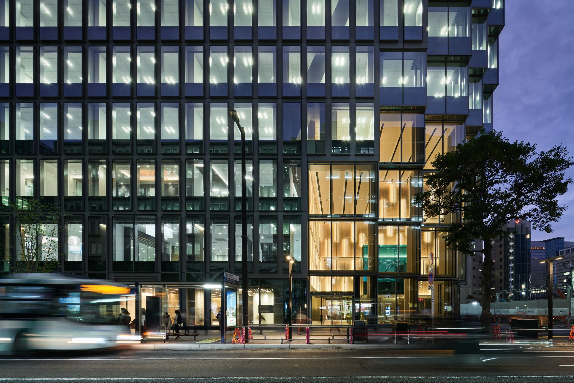
Tenjin Business Center, Fukuoka, Japan
OMA
This mixed-use office complex by OMA in Japan's fifth largest urban hub has just reached completion. Led by OMA partner Shohei Shigematsu, the scheme is the studio's first in town - which is also the architect's home town. ‘The building program is predominantly workspace, within a given massing that is neither low-rise nor tower, so the design was conceived through hyper-focused interventions that subtly merge and connect human and urban scale, two streets of different character, inside and outside, city and nature. The result is an efficient office block with the most memorable corner—an excavation of the building toward more openness. A Big Bang signifies a starting point, and I hope this gesture will be an invitation for future developments to participate in creating a network of activated intersections and public zones that knit the new district together,' he says.
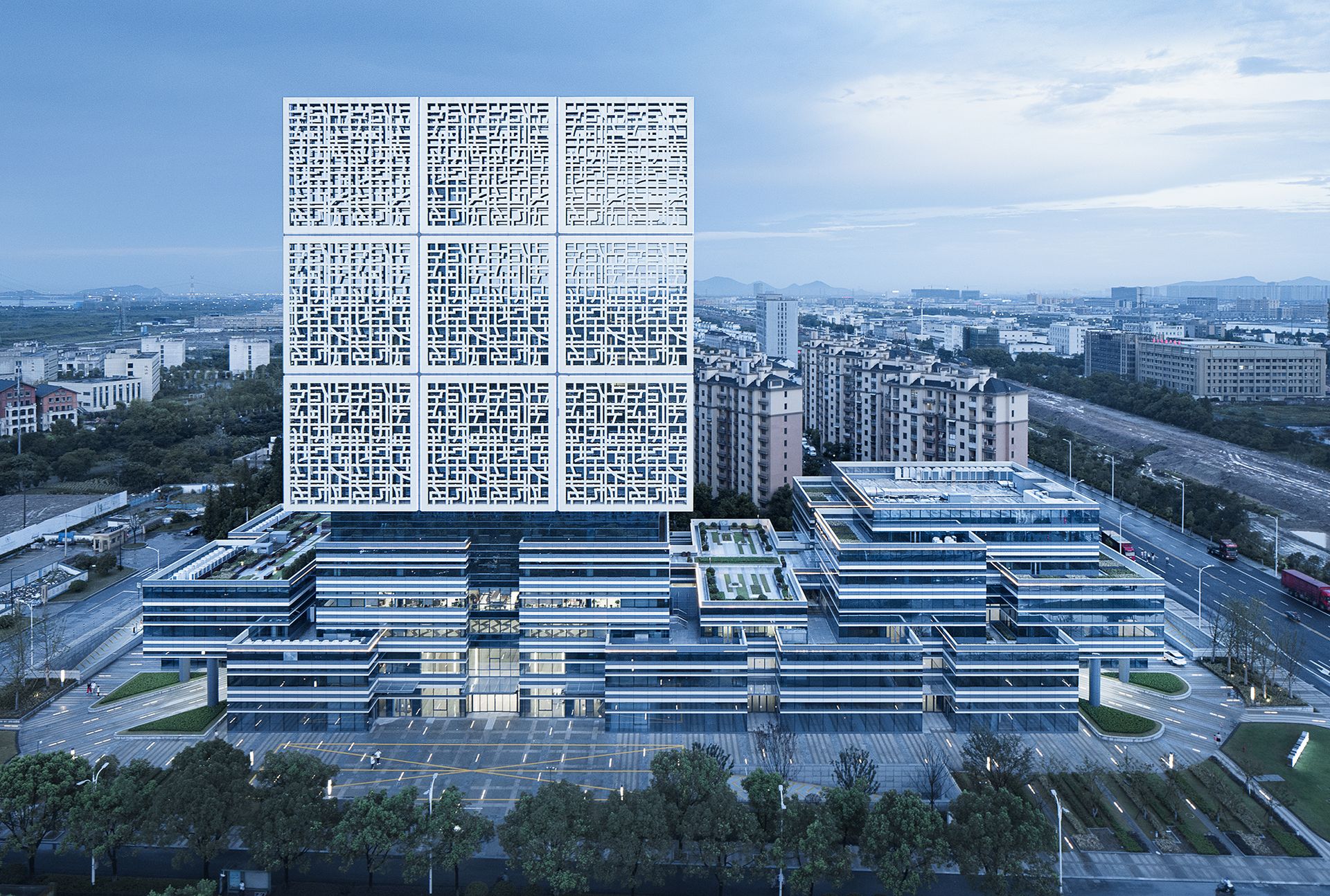
Xiaoshan Innovation Polis · Pioneer Valley, China
UAD
Part of the Hangzhou Xiaoshan Innovation Polis, a business hub on the south bank of Qiantang River, this impressive piece of architecture is a key piece for the wider development as well as a future landmark for the Chinese city. ‘To cater to the needs of young innovators, researchers and entrepreneurs in Xiaoshan Innovation Polis, the design adopts the concept of the ‘Cube', which signifies the infinite possibilities of entrepreneurship and scientific research and the vitality of the young,' say the architects. ‘With staggered elegant cubic volumes and artificial lighting at night, the building presents a futuristic, instagrammable image throughout the day at the side of the Hangzhou-Ningbo Expressway, hence becoming an iconic landmark that represents Xiaoshan Innovation Polis.'
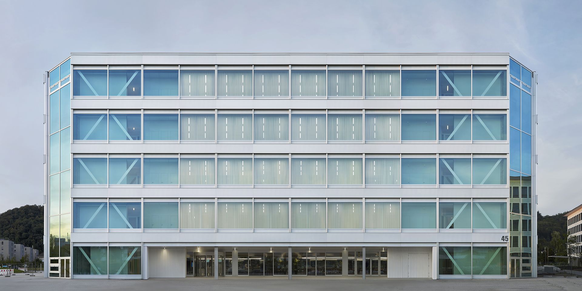
Roche Pharmaceuticals, Germany
Christ & Gantenbein
An ‘industrial palazzo’ has been added to the growing campus of Roche pharmaceuticals in Grenzach-Wyhlen, Germany, near the Swiss border. The building, carefully tuned to balance the generous, no-nonsense attitude and durability of an industrial building and the cutting-edge, sleek feel of contemporary office architecture, is the creation of Christ & Gantenbein. This is the third structure that the Swiss architecture studio, located in nearby Basel, has designed for the healthcare multinational – but it’s one that stands out for its minimalist expression and cool, almost painterly nature. Roche’s multifunctional workspace building follows the architects’ signature approach and aesthetic that blends the use of seamless, scuptural concrete with pared down forms and supreme functionality. The studio has carved a reputation as a deft hand at balancing drama and subtlety, the hardness of concrete with soft, plastic forms.
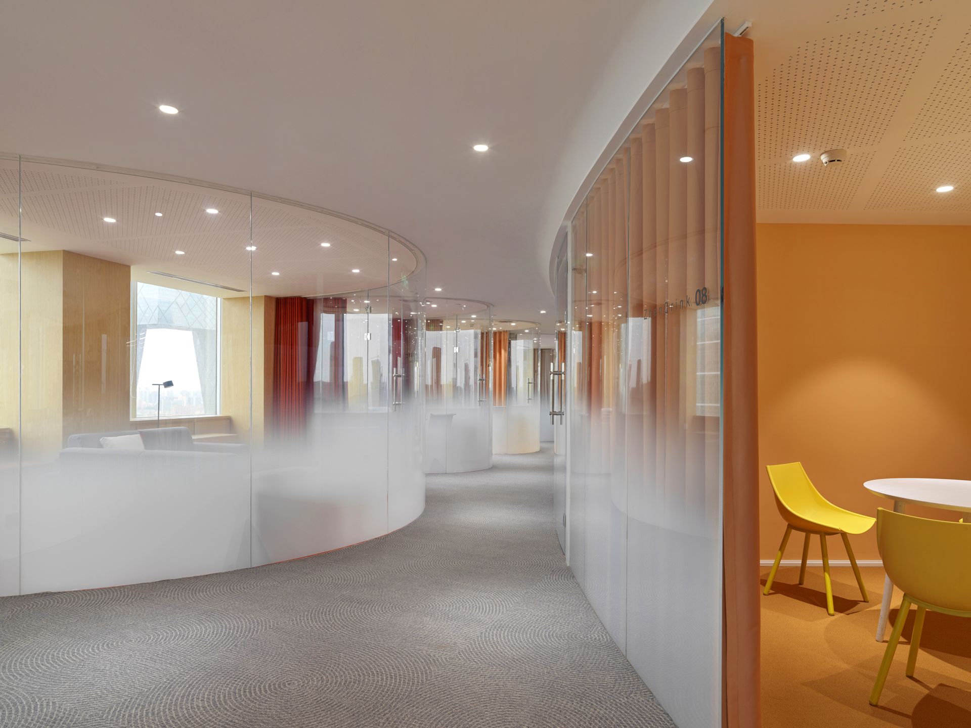
Zhen Fund, China
Asap
This ethereal interior belongs to the new offices of the Zhen Fund, a financial company in Beijing. Its authors, New York and Los Angeles-based Adam Sokol Architecture Practice (Asap) were tasked with redesinging the interior of a high rise in the China World Trade Center. The result is a workspace explored through curves and colours. ‘Much of our recent work has explored various types of curves, and so we began to explore how that would impact this design as a solution,' says Sokol. ‘While seemingly inefficient at first glance, the curving glass conference rooms that became the signature of this project actually accomplished several things: they avoided the monotony of long double-loaded corridors that we all dreaded; they gave the design an immediately bold and visionary quality; lastly there was the happy benefit of the pockets of space created where the rooms meet.'
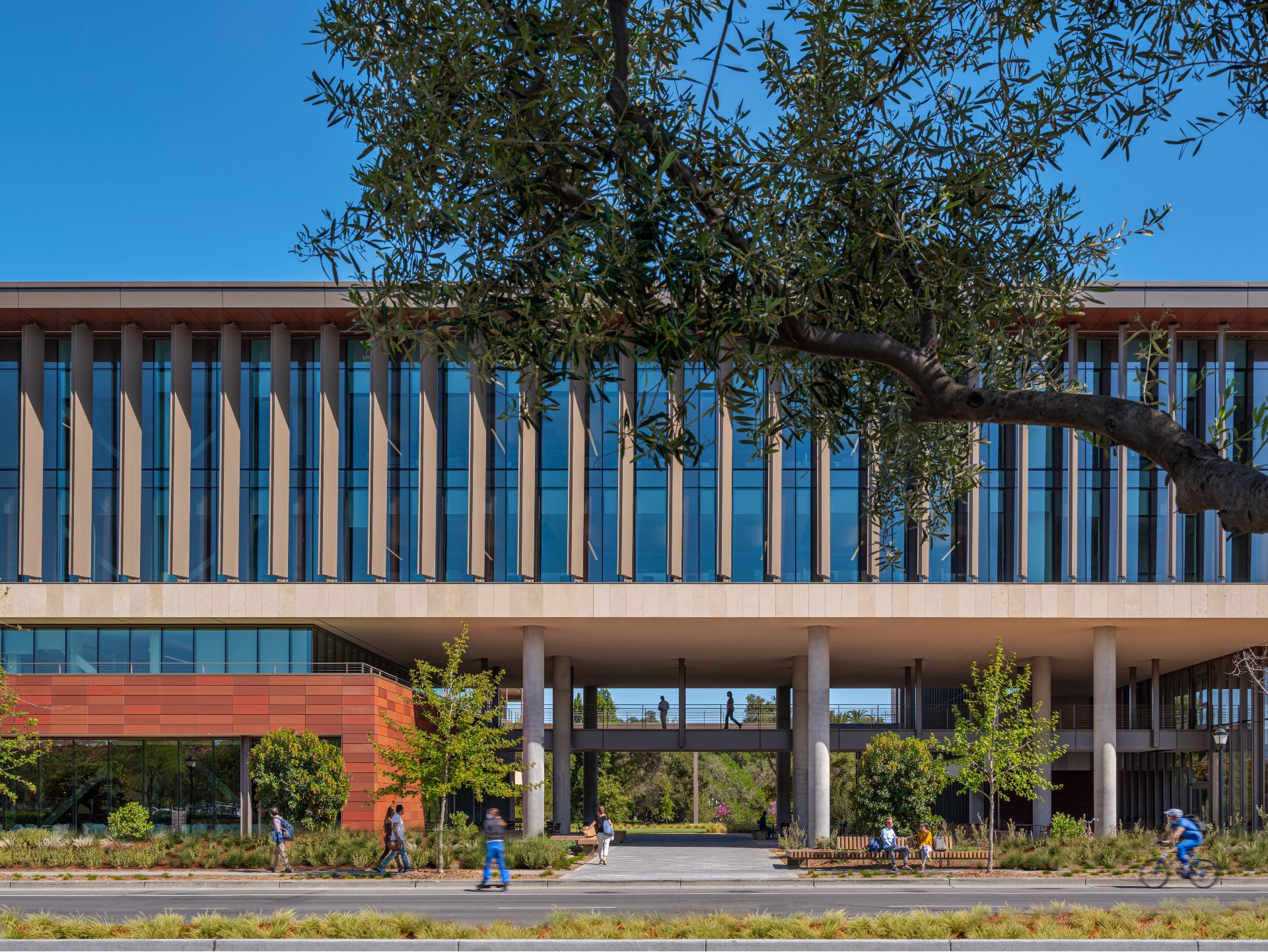
Stanford University School of Medicine, USA
HOK
The new building for the Stanford University School of Medicine, designed by HOK, has a special twist. Located in Palo Alto and making the most of the mild Northern California climate, the architects moved 20 percent of the program outside the building’s walls. Porches, balconies, and covered walkways become an essential part of the workspace, offering deskspaces and social hubs al fresco for the employees, arranged around the U-shaped, clean and modernist inspired building.
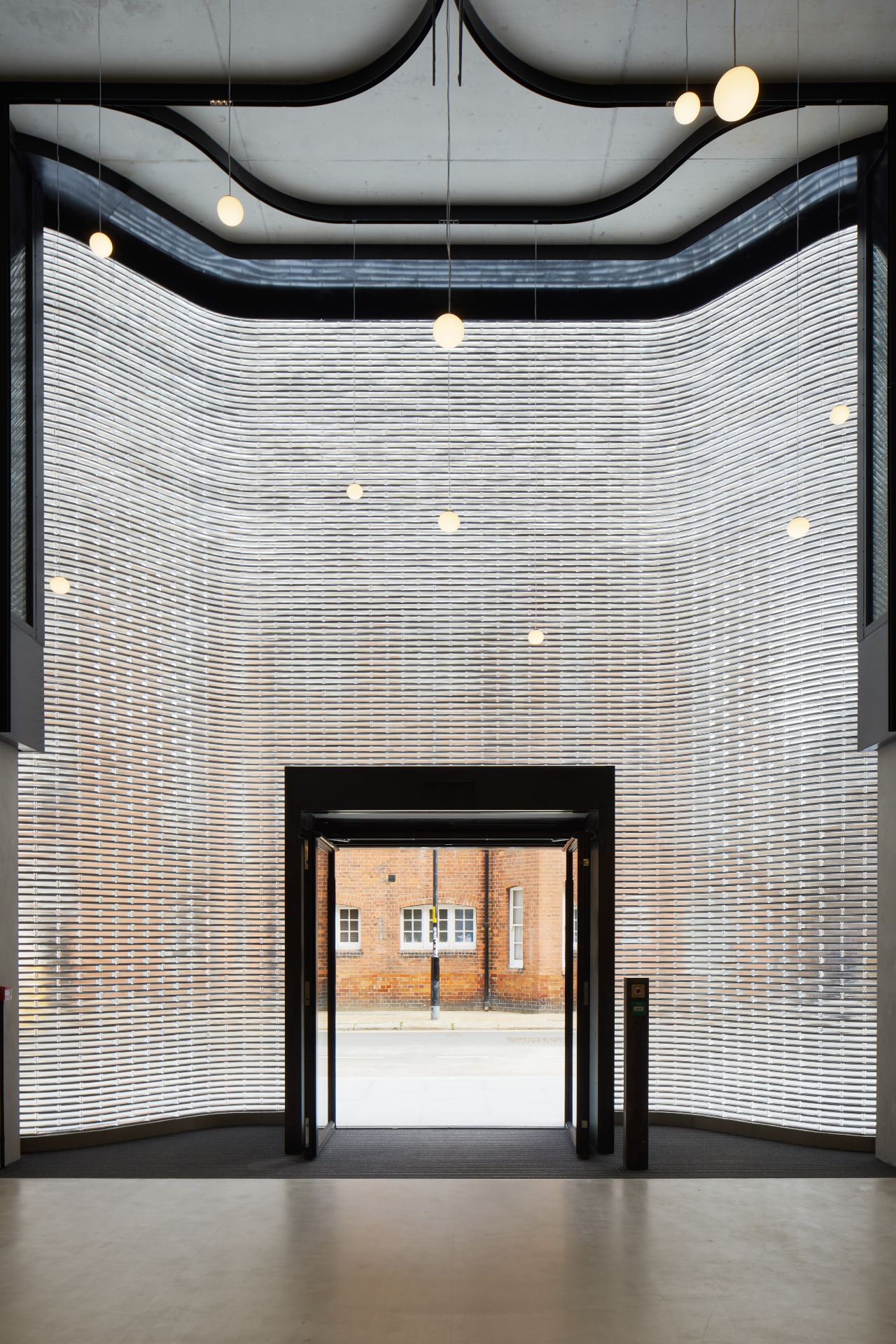
Southworks, UK
SPPARC
Developed by MiddleCap and designed by architecture studio SPPARC in London, this new project claims to be ‘the smartest office in the world'. The aim was to create a building that is both sustainable and future-proof in terms of wellbeing and the pandemic. Spanning seven floors, the innovations lie in the building's technological core that helps create a flexible, responsive environment for the employees. Meanwhile, a sinuous brick façade helps the scheme blend in its Southwark context, taking its cues from neighbouring structures.
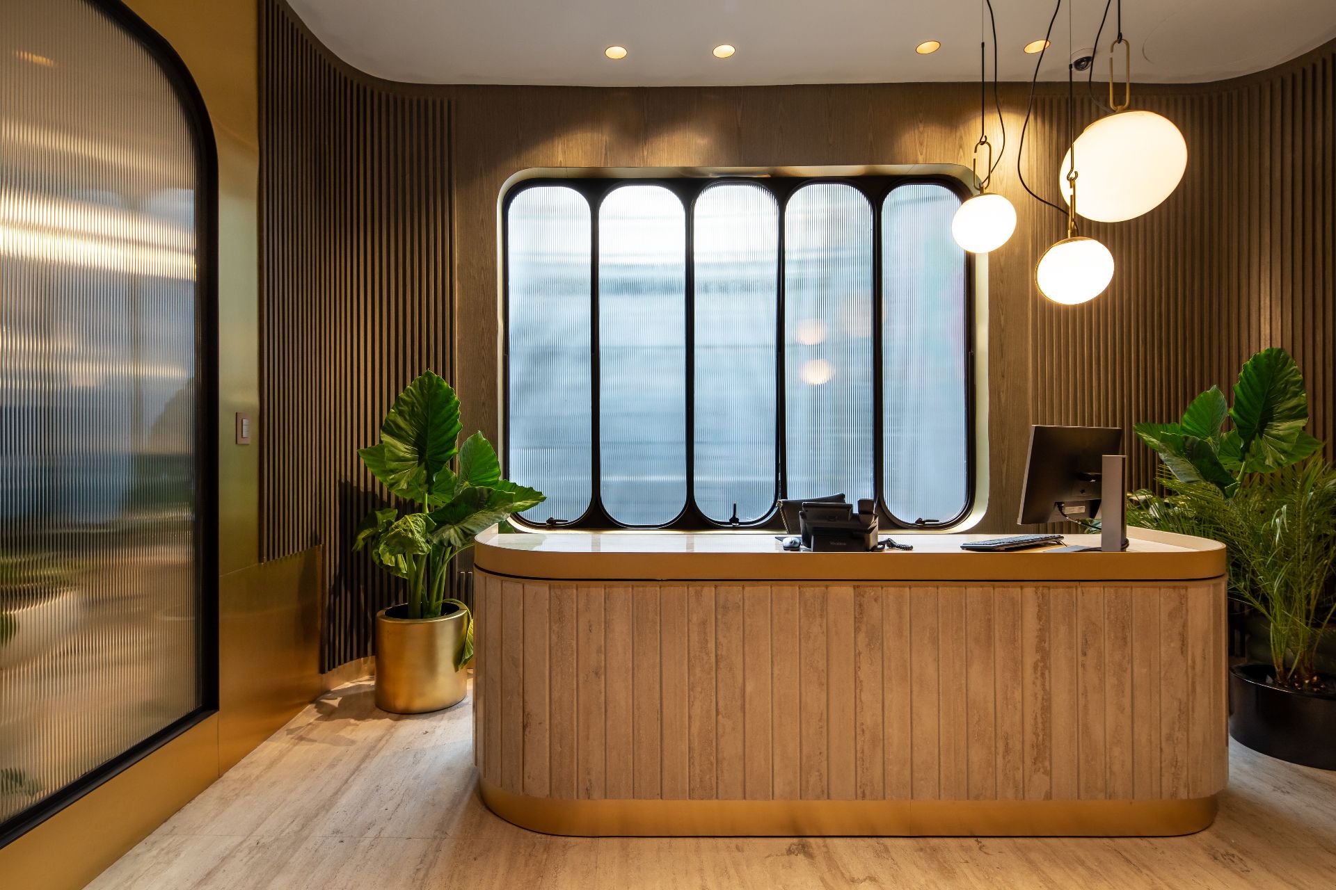
203 Masaryk PH Offices, Mexico
Álvaro H. Félix Studio
Drawing on a mid-sixties modern Mexican style, the architects at Álvaro H. Félix Studio have transformed a penthouse space on Masaryk Avenue, in the swanky Polanco neighbourhood of Mexico City. The result? A workspace that feels contemporary but also homely, balancing a retro feel (filled with metallic walls, golden tones and travertine marble details) with all the mod cons and spatial generosity a modern office needs. ‘The project reenacts the aesthetics of the revival of the financial markets in Mexico. A proposal that reimagines objects, materials and formal details which we grew up with like marble, wood and metal; it blends in contemporary design in a timeless eclecticism,' explains the design team.
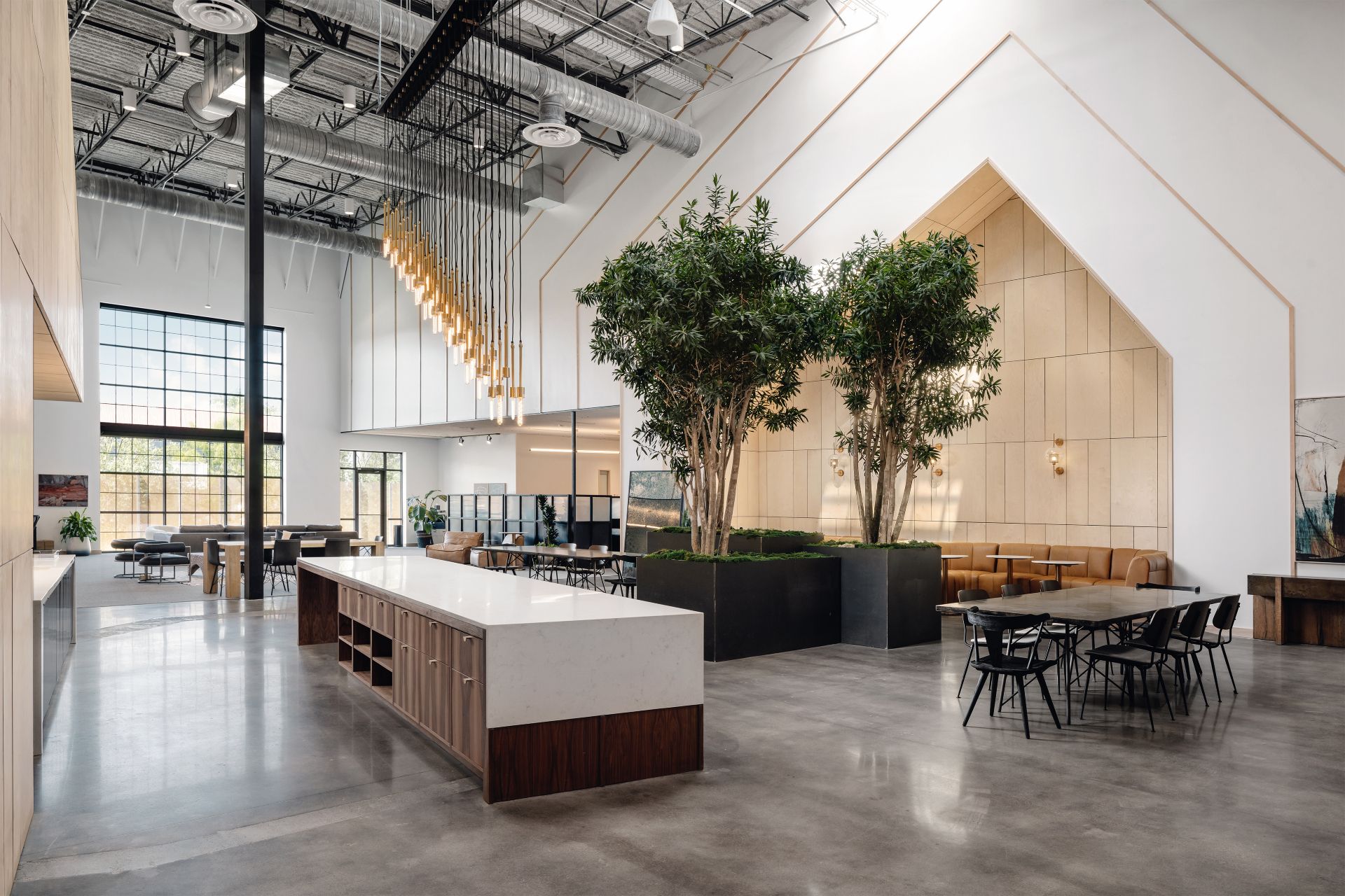
Four Hands HQ, USA
Michael Hsu Office of Architecture
Four Hands, Austin’s leading global designer and wholesaler of trendsetting lifestyle home furnishings, now can boast a brand new, state-of-the-art office space. The designer behind it is Texas based Michael Hsu and his team, who aimed to balance the client's brand expression of classical style and nostalgia, with a forward-thinking approach and space. ‘We started with the question, ‘what if we built a house inside a warehouse?' With 24' high ceilings, and little access to daylight, how can we imbue this space with beauty, a human scale and sensibility?' says Hsu. ‘Ultimately we landed on a house-like central axis, which defines the expansive workplace. It will house meetings, private offices and get-away rooms. The ‘house' gets sliced by two light flooding paseos, bringing essential daylight and views to even the most far removed desks.'

Smithson Tower office, UK
ConForm Architects
Central London is chock-full of iconic architecture, but few buildings represent the brutalist style better than the iconic Smithson Tower – previously known as the Economist Building – which was designed in the early 1960s by Alison and Peter Smithson. Now, this piece of Grade II* listed modernist architecture includes a brand new warm and minimalist office interior, courtesy of ConForm Architects. Sat on the high rise’s 11th floor and occupied by a financial client, the workspace is sleek and contemporary but at the same time, the minimalist architecture feels homely and inviting, creating a comfortable, almost domestic working environment. The open floorplan adds to the steamlined look and directs the gaze towards the long views of the London skyline afforded by the windows. ‘The design responds to the contemporary move towards designing offices that are collaborative rather than cellular,’ explain the architects.
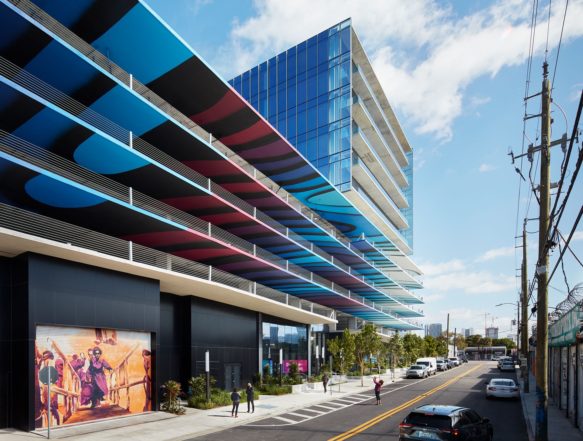
545wyn, USA
Gensler
545wyn in Miami is a modern office building by global architecture practice Gensler. Celebrating the city and the community of Wynwood, where the project is located, the design team incorporated colourful architecture, murals and installations - a nod to the garment district's heritage of warehouses and graffiti art. ‘545wyn delivers an expressive backdrop to the community, uniting all that surrounds as a beacon of creativity,' say the architects.
Signify Health, USA
Perkins & Will
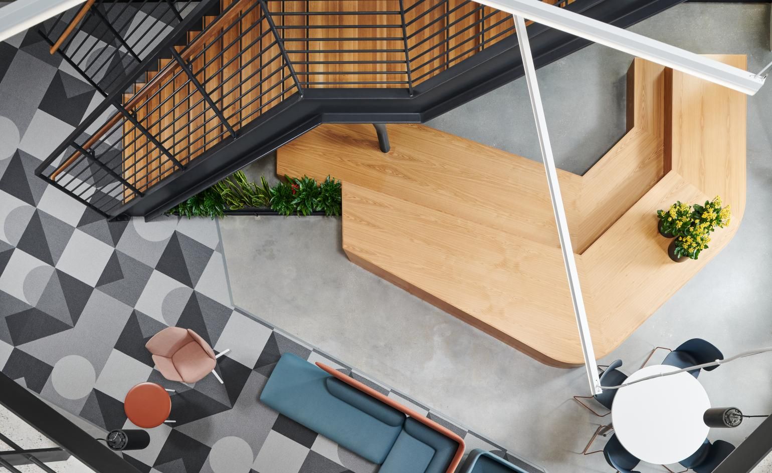
Perkins & Will has created the home of healthcare platform Signify Health in Dallas, Texas. Following their client's values around ‘happy, healthy days at home,' the architects designed an office architecture that blends technology and wellness. High ceilings, large openings and plenty of light offer a sense of space and generosity. Meanwhile, ‘The design team equipped the flexible office with collaborative work areas dispersed with meeting and breakout rooms to form “workplace neighborhoods.” The intention here was to create transparency and accessibility, similar to a “living organism,” thereby tying the design theme back to healthcare and the company’s dedication to well-being,' the team explains.
The Mill Project, India
Quirk Studio
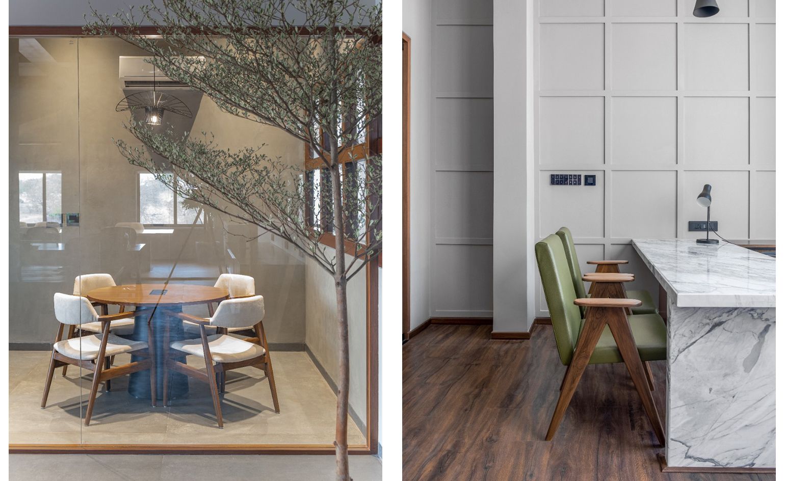
Mumbai interior design studio Quirk, lead by Disha Bhavsar and Shivani Ajmera, are behind this office space in the city of Erode, Tamil Nadu. The interior is the headquarters of a family-run enterprise. Aiming for a luxurious but also functional workspace environment, the design team mixed the principles of Wabi-Sabi with mid-century modern's timeless design style. A blank industrial canvas of raw materials, such as concrete and wood, is overlayed with contemporary furniture inspired in clean, modernist-inspired shapes.
Choose, Greece
dARCHstudio
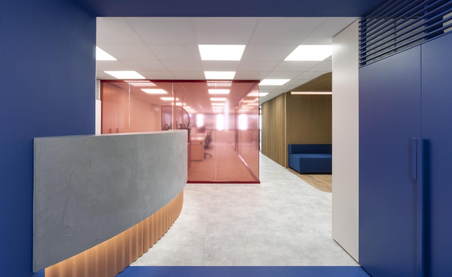
An advertising office in Athens has been transformed into a minimalist, geometric, colourful composition by dARCHstudio. ‘Custom-made red objects - conceptualised as “totems”, which consist of a metal dividing mesh and shelves with flowerpots, are an integral part of the design, placed in strategic positions throughout the officespace. Each consists of a different synthesis of plants and mesh alluding to the beauty of the plants and an earthy sensation,' say the architects.
UP!, Germany
Jasper Architects
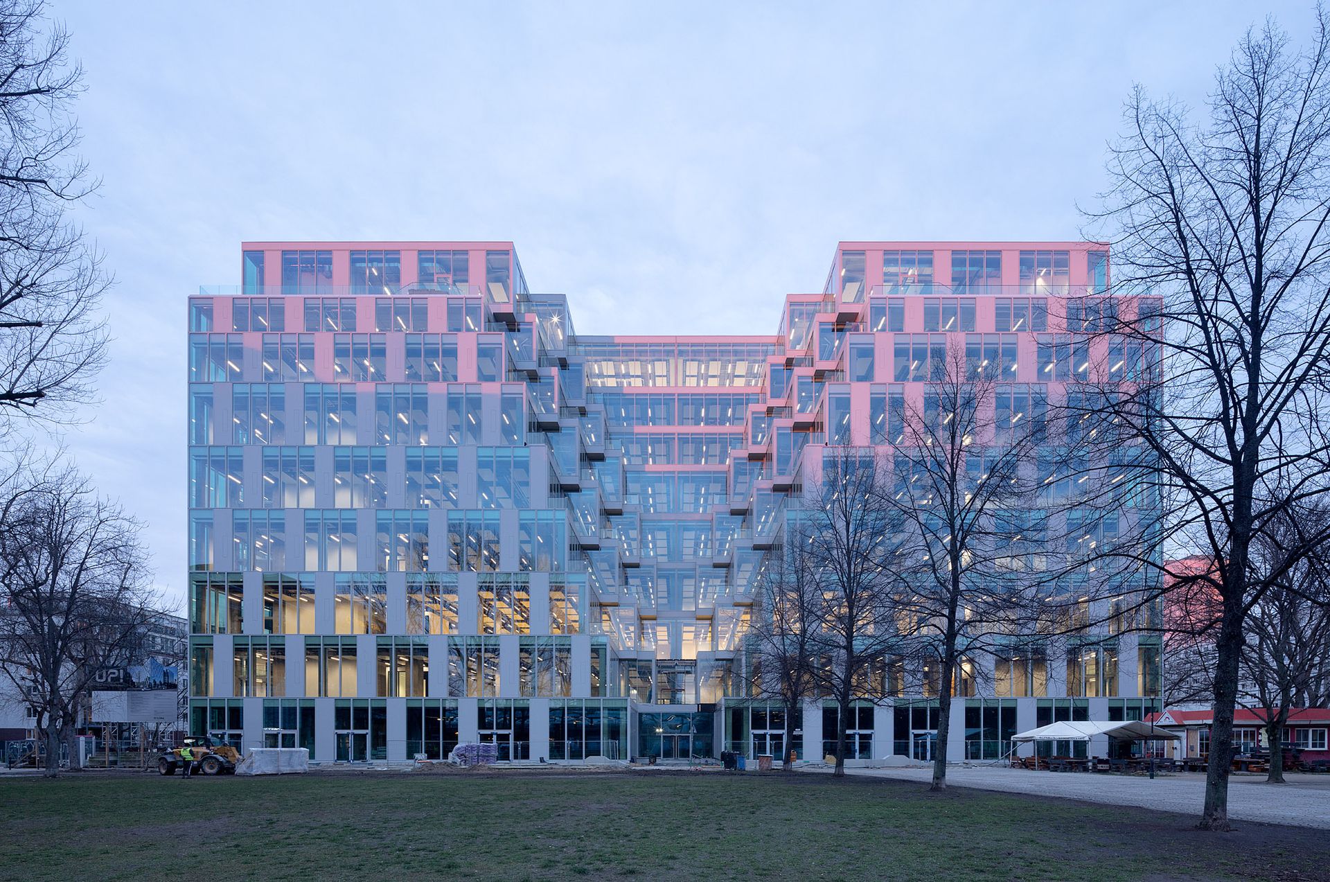
International architect Martin Jasper has completed UP!, a workspace in East Berlin, which creatively reuses a former shopping mall. The redesign, which is situated in the city's Friedrichshain neighborhood, houses offices and some retail within a new, glazed envelope. The architect, who has worked a lot in Argentina, drew inspiration from the blocks of Buenos Aires. ‘The existing building looked like a monolithic extrusion of a city block there', he says.
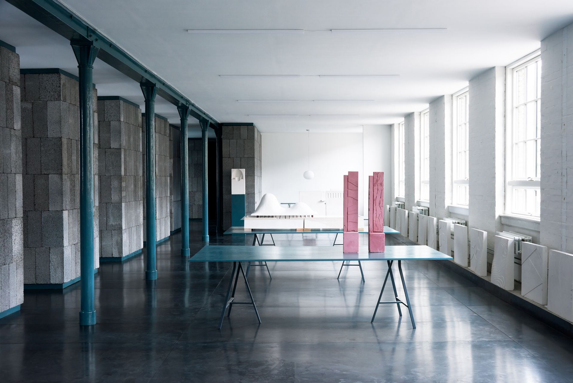
Copenhagen office, Denmark
NORRØN Architects
A former textile warehouse in Copenhagen has been transformed into a ’territory for dreaming’. The office space has been designed by locally based NORRØN Architects. The use of raw materials, colourful architecture and reflected light enhance the space and add character. Detailing was also very important. For example, ‘a dark shiny green color was chosen in different sections of the office to add a certain depth to the architecture of the space, as seen both at the entrance and the furniture of the office,' says the team.
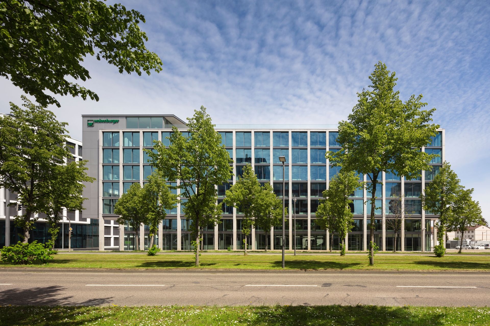
Weisenburger HQ, Germany
Tadao Ando
The new construction and developent company headquarters in Karlsruhe for the weisenburger group has been designed by none other than celebrated famous Pritzker Prize winning Japanese architect Tadao Ando. Following its creator's signature style, the office features concrete and glass surfaces and a facade arranged in a neat grid. ‘The building is effective in its simplicity. Concrete plays a key role as our main building material. Reducing it to the essentials is simultaneously reflected in top efficiency. For us, straight lines and pragmatism are key,' says the client's managing director Nicolai Weisenburger.
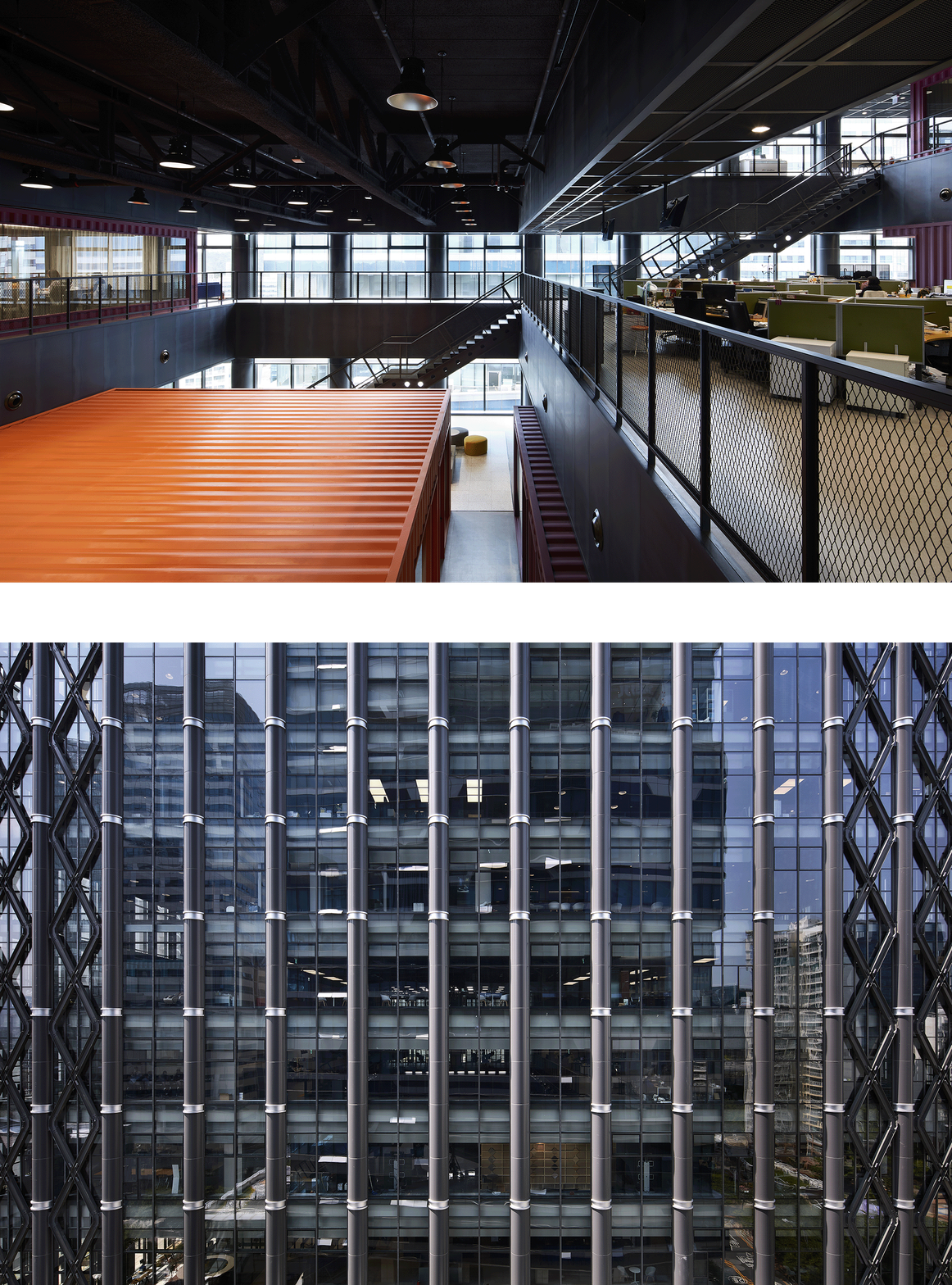
JTBC HQ, South Korea
THE_SYSTEM LAB
JTBC, the largest media company in South Korea, now has a new contemporary headquarters to suite their reputation, courtesy of local architecture studio THE_SYSTEM LAB. Internal flexibility was the name of the game here. ‘We felt that the rapidly changing media environment doesn’t allow us to build a confirmed space with fixed programmes. We also had to consider 3 year time gap between the time we started the design and the time the construction would be completed. Therefore, we decided to build a physical infrastructure that could contain an agile process,' say the architects.
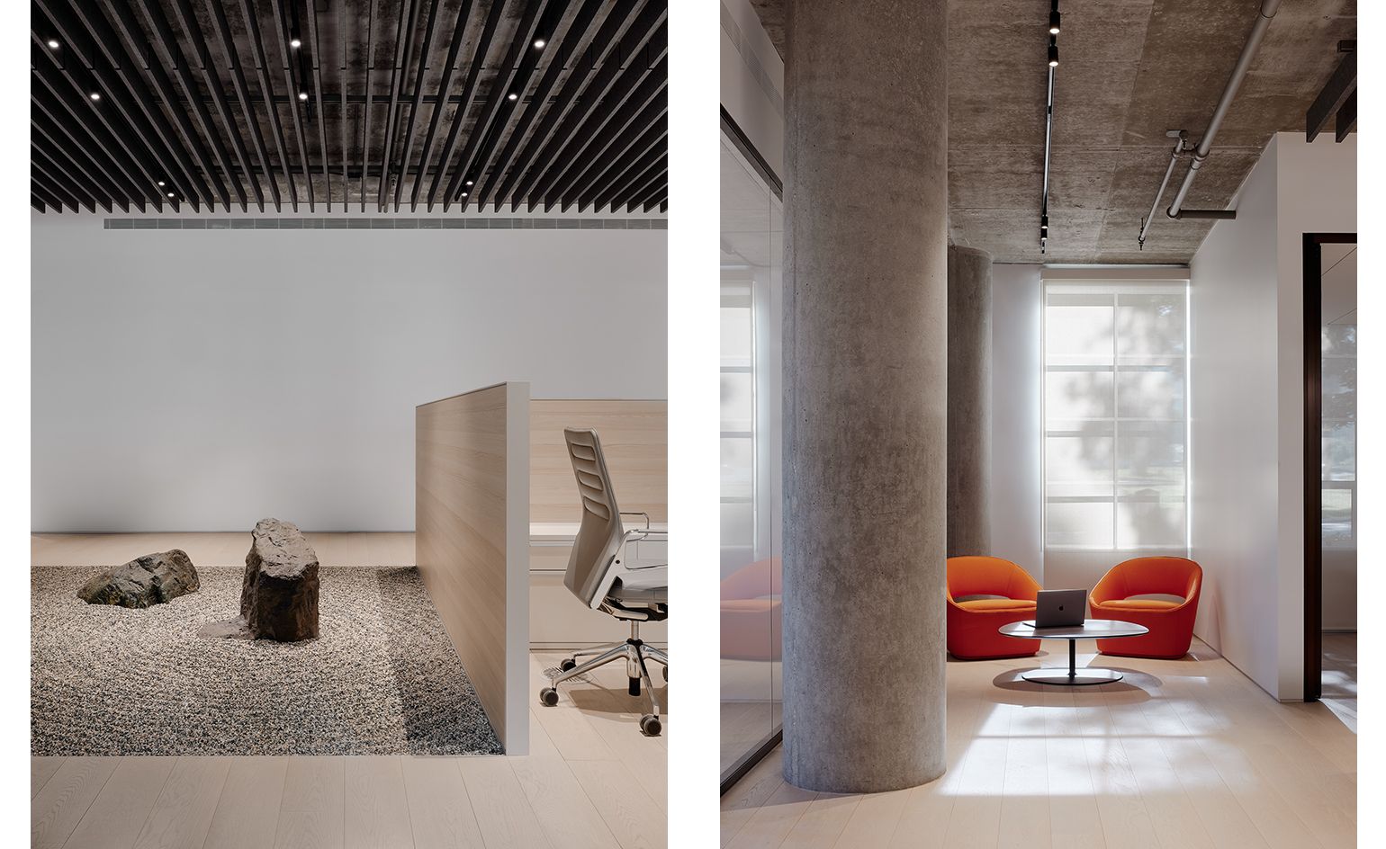
The Column Group, USA
Garcia Tamjidi Architecture Design
When a venture capital firm in San Francisco asked Garcia Tamjidi Architecture Design for a new office space that is both calm and open, the architects responded by creating a sleek, minimalist interior using transparencies and neutral colours to create flow and a sense of space. At the same time, ‘Japanese-influenced rock and gravel gardens subtly define individuated spaces and create circulation between the public and private work areas,' explains the team.
Block722 studio, Greece
Block722
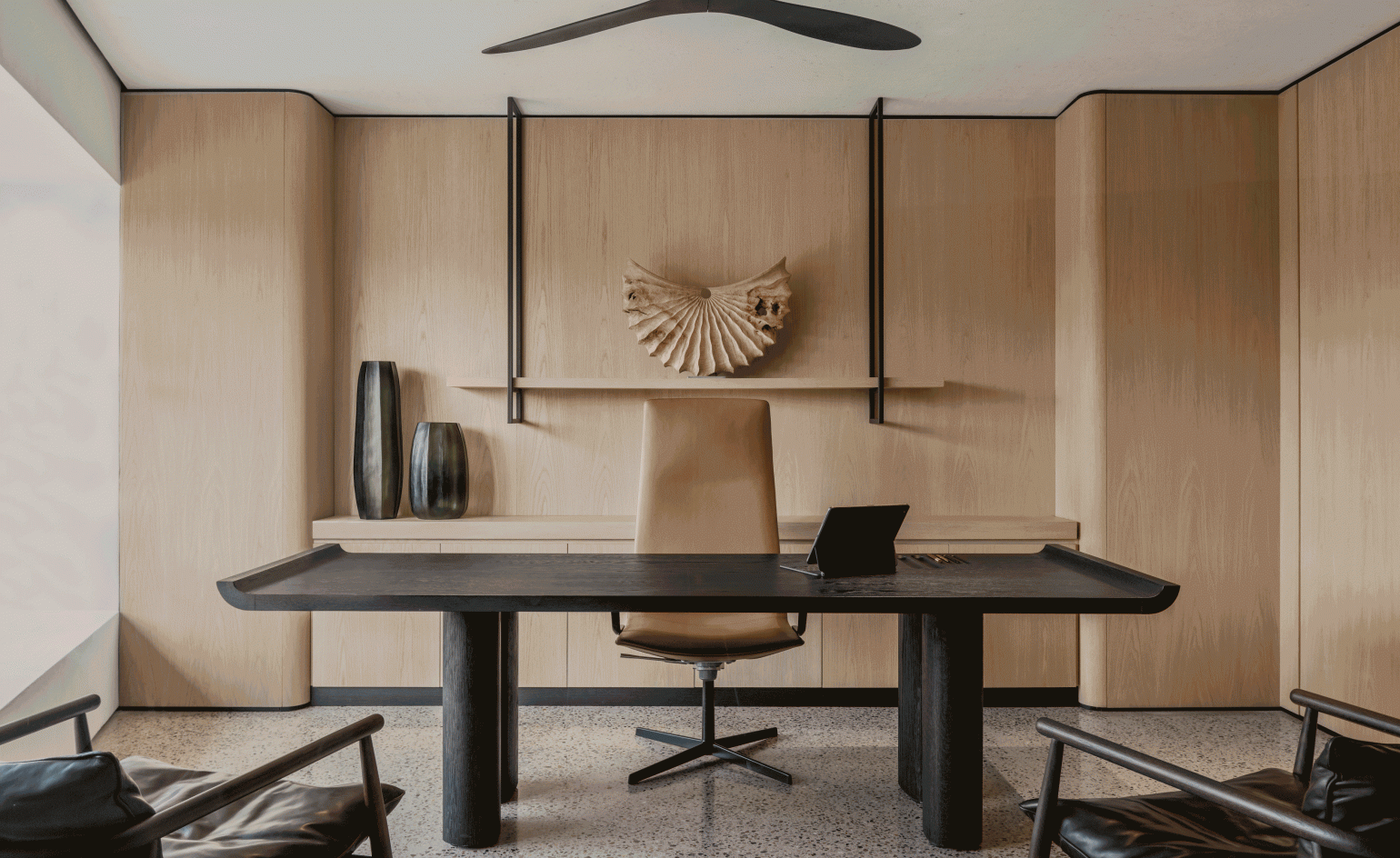
A refined workspace created by architecture studio Block722 for their own use, this Athenian interior makes the most of an existing office unit and long views of nature and ancient ruins in the heart of the Greek capital. By gutting the space to rebuild a flowing, open interior that fosters collaboration, the architects created generous, light filled spaces. Calming colour tones, natural materials and a sense of balance prevail. Artworks and craft-led bespoke items, such as pieces by Greek contemporary artist Pantelis Chandris, local artisan Serpetinis, a fabric woven by Athens based textile artist Chrysa Georgiou and sculptural pieces by French artist Benoît Averly, enrich the daily experience of working there for the some-30 staff.
Citi Wealth Hub, Singapore
Ministry of Design
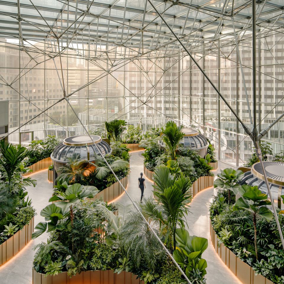
Created as offices and centre for Citigold members and private clients, this banking hub in Singapore is the brainchild of local studio Ministry of Design. Set in an existing building that has been transformed, the new space is an immersive experience, wrapped in greenery and striking city views. A generous, glass-enclosed atrium features a thriving indoor conservatory, which becomes the perfect space to meet people, relax but also host events and presentations. Specially designed pods within it, clad in Kvadrat Remix 3 fabric panels, Aural Aid veneer panels, and kitted out with curved LG OLED TV screens, provide a more private option for work and discussion.
100 Liverpool St, UK
Universal Design Studios
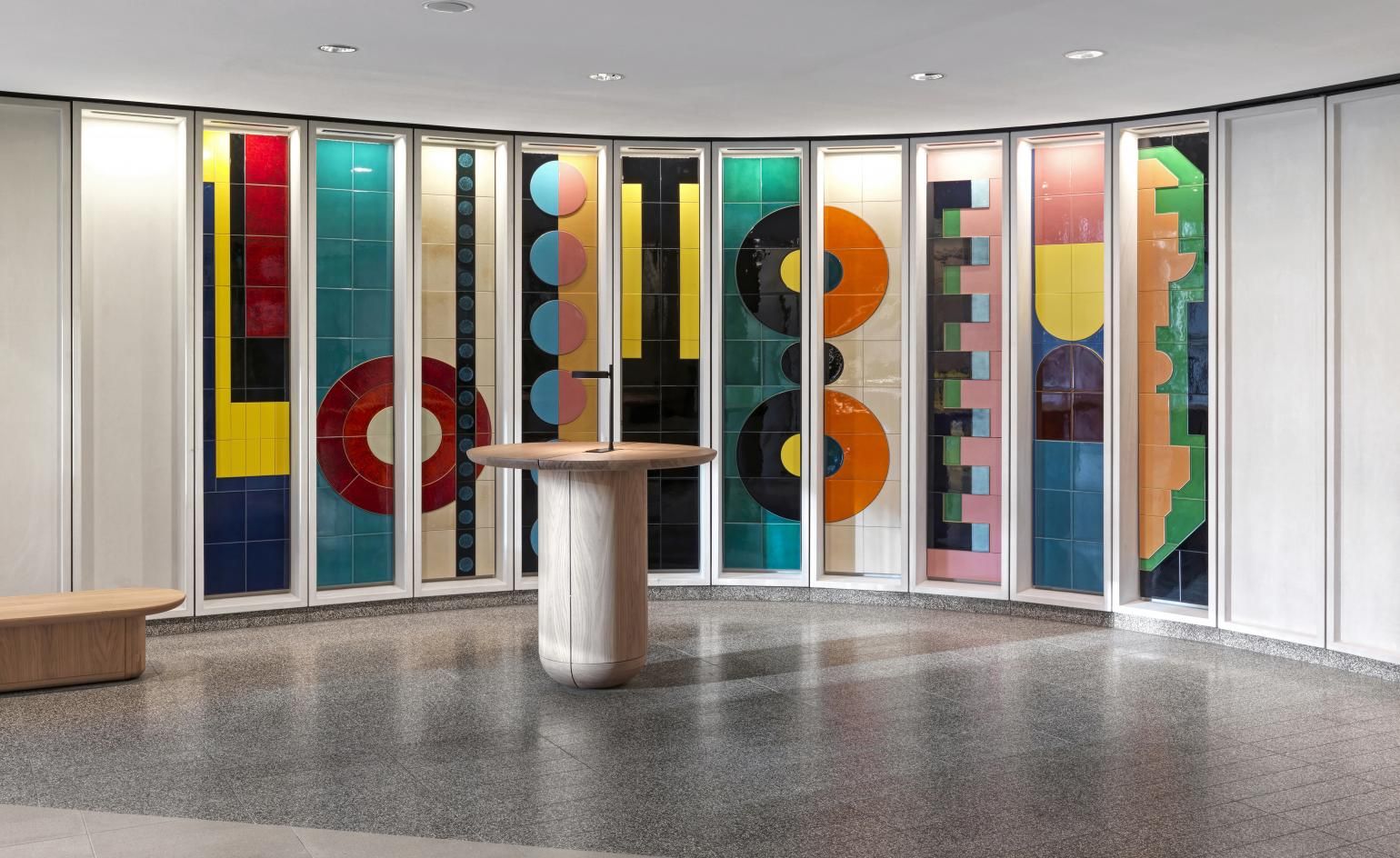
The interior design of parts of a Hopkins Architects building in the City of London, this project, by Universal Design Studios, tackles the entrance lobbies and the second floor lobby, main reception, café, informal meeting and flexible
work areas. ‘Universal’s focus for the lobby areas was to create active and usable spaces which are inviting and encourage dwelling, as such a range of seating and furniture is used throughout to accommodate different modes of working from informal meetings and focussed work to team collaboration,' say the designers. The project includes a striking, colourful, ceramic art piece by Lubna Chowdary in the ground level entrance lobby.
Community Information Centre, USA
Efficiency Lab for Architecture
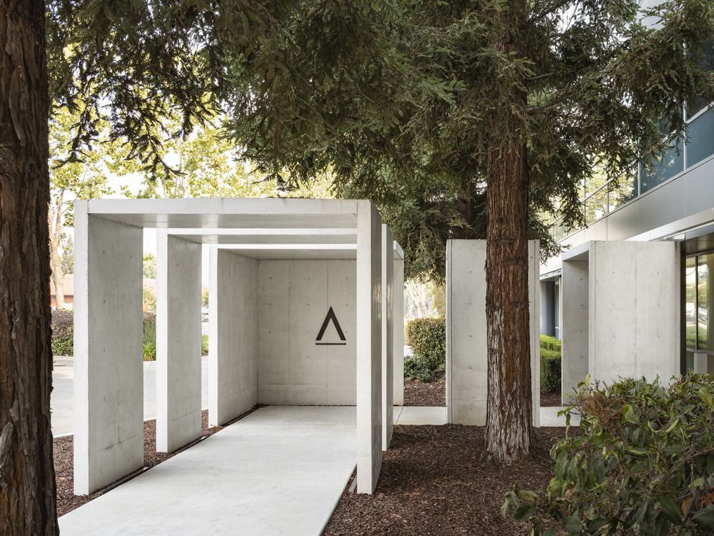
This some-10,000 sq ft office space is an example of clever adaptive reuse in San Jose, California. The design, for the Community Information Center by Brooklyn practice Efficiency Lab for Architecture, forms part of a larger development project that will transform an existing office park into a learning campus. This centre, the first phase of this ambitious project, acts as an information hub and contains a reception/lounge area, an 80-person presentation room, meeting rooms, interview rooms, and staff offices, all within a modern, open plan design.
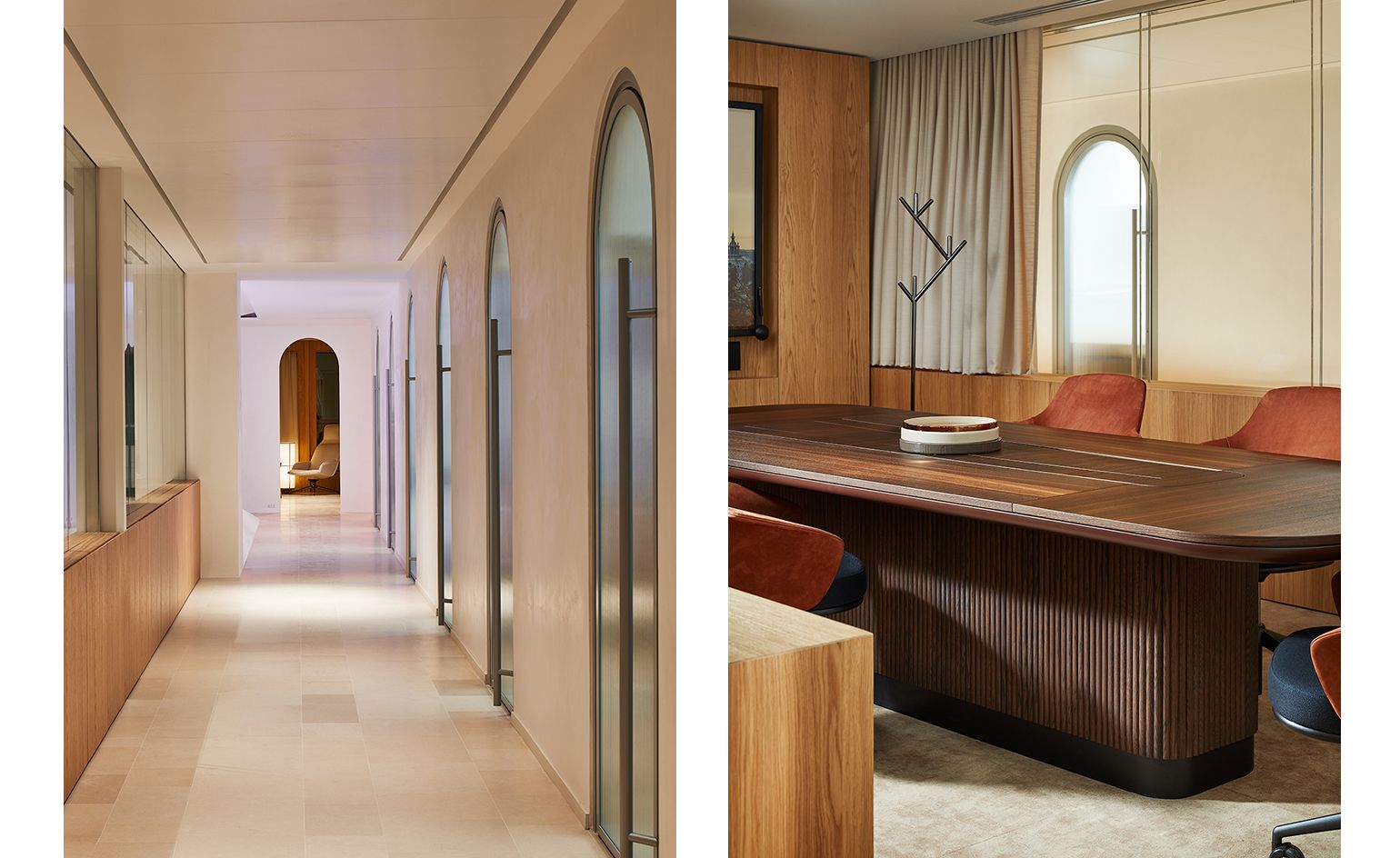
Office in Paris, France
Louis Denavaut
Interior architect and designer Louis Denavaut has turned his hand to almost anything from retail, to residential and art spaces. His latest work, an office interior in Paris' Matignon neighbourhood, responds to a brief that dictated the combination of ‘cutting-edge technology with contemporary aesthetics.' Set in an existing, period building with an empty floorplate and large windows, Denavaut's space mixes warm woods, geometric compositions, careful lighting and linen curtains to convey domesticity and comfort, while maintaining sharp, modern lines and materials.
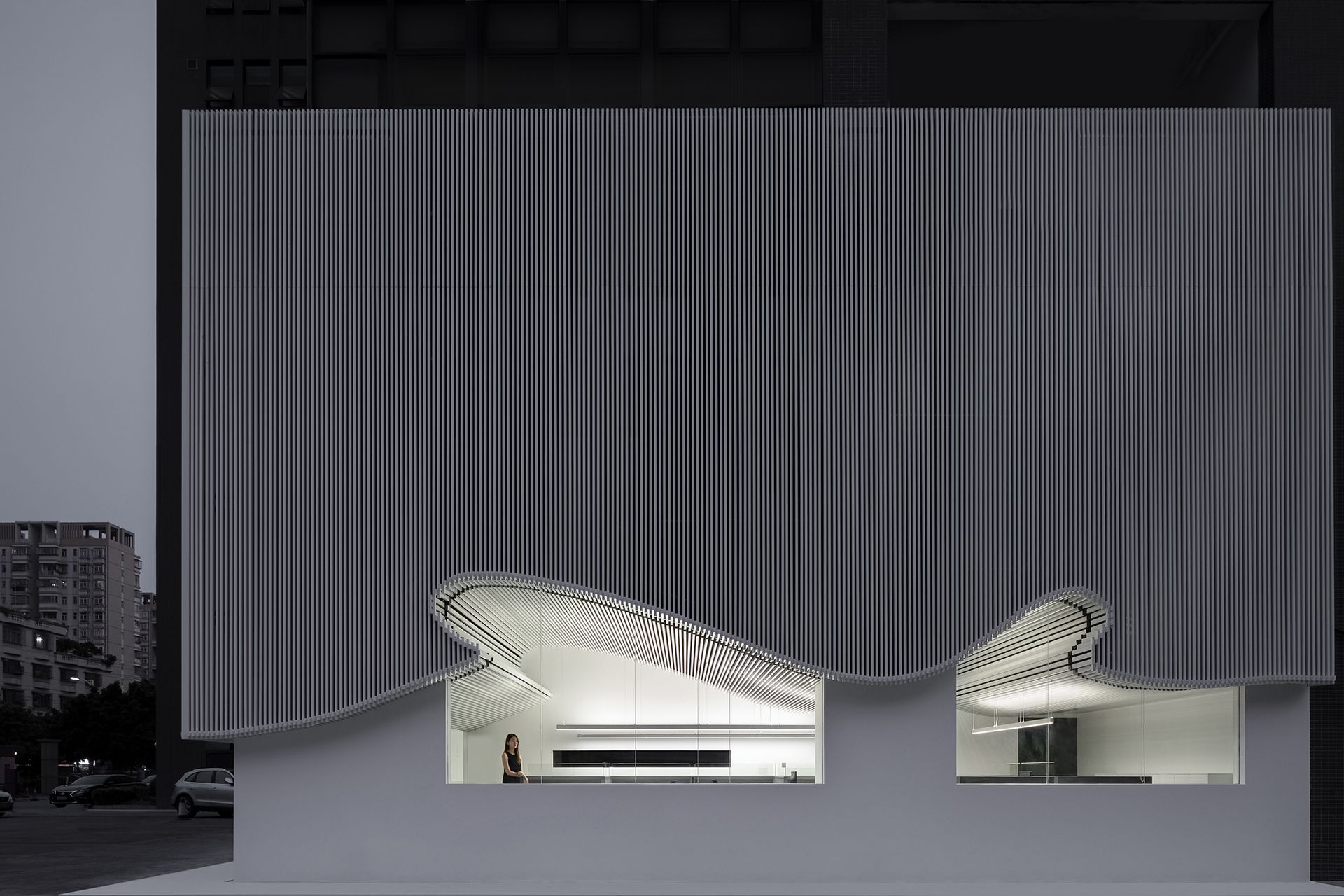
Runxuan Textile Office, China
Lucien International, Masanori Designs
Sometimes building designs take their visual cues from what's going on inside them. This was the case with a new textile company's headquarters in Zhangcha, the well known fabrics producing urban hub in Foshan, China. Designed by Lucien International - Masanori Designs, the new building combines pure white tones with an undulating facade that mimics the movement of textile. With the curved tile facade dominating the first floor, where offices are, the ground level is left clean and simple, visible from the street through large glazed expanses. Minimalist white office furniture within blends effortlessly with the similarly pared down architectural features.
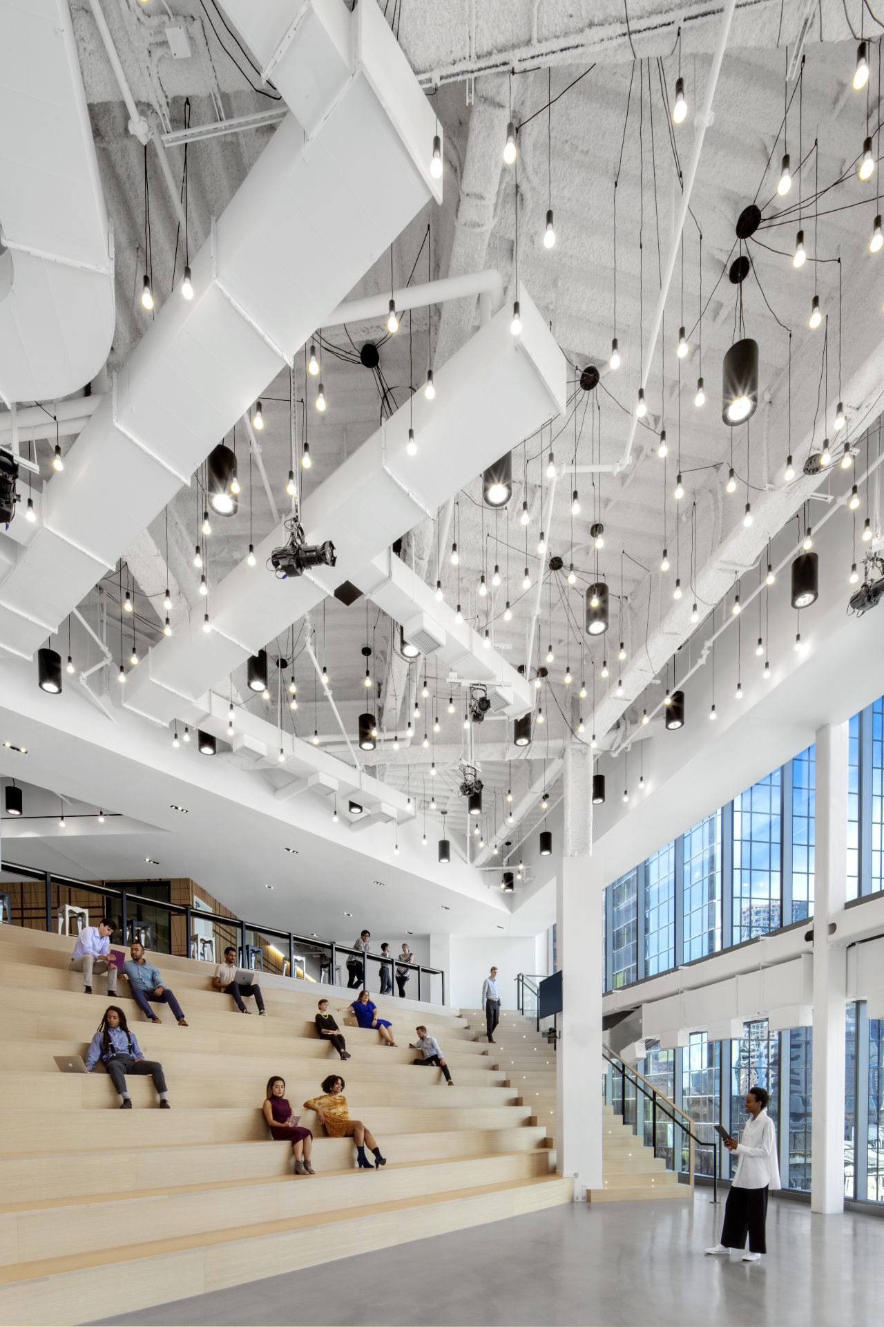
Publicis Groupe, USA
Elkus Manfredi Architects
Created as an ‘activity-based' workspace, the brand new Publicis Groupe offices are designed by Boston based Elkus Manfredi Architects. The international communications company needed space for its some 1,500 employees in the city. The architects consulted the users in co-creating the space in a process that touched upon anything from furniture, culture and work settings. The office now occupies five restored historic buildings, topped with a modern glass addition. Interiors feel bright, flexible and contemporary.
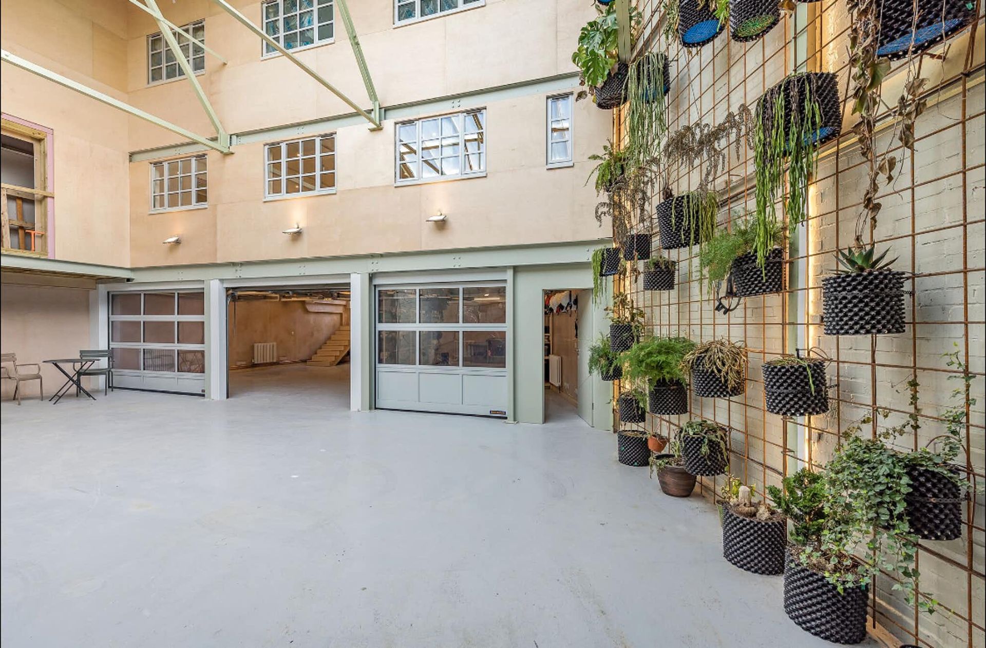
Wotton Works, UK
Simeon Anderson, Caireen O’Hagan, Corinne Quin
A new, sustainably minded office space has just opened up in London, in a relatively unlikely place - the northern neighbourhood of Cricklewood. Created by Simeon Anderson with the help of ex-Ilse Crawford studio designers Caireen O’Hagan and Corinne Quin, Wotton Works is a live/work complex set in a former aircraft parts factory. Its vast size - a lovely feature inherited from the building's past industrial use - meant the designers could fit flexible office space alongside residential units. This brand new hub is just a 15 mins train ride from central London.
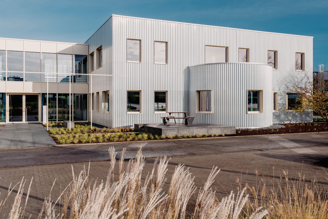
AEtelier, Belgium
Studio Anton Hendrik Denys, with Steen Architecten
Combining the region's industrial heritage with a wild, green garden, this office building is a refreshing piece of architecture that brings together clever, sharp contemporary design and nature. The project, designed by local designer Studio Anton Hendrik Denys in collaboration with Steen Architecten houses an IT consultancy's headquarters. The brief outlined the refresh of an existing structure in an industrial zone in central Belgium. The architects obliged, stripping away the original building and transforming it using softly reflective, undulating, silver-coloured aluminium panels. A lush garden complements the architecture through contrast.
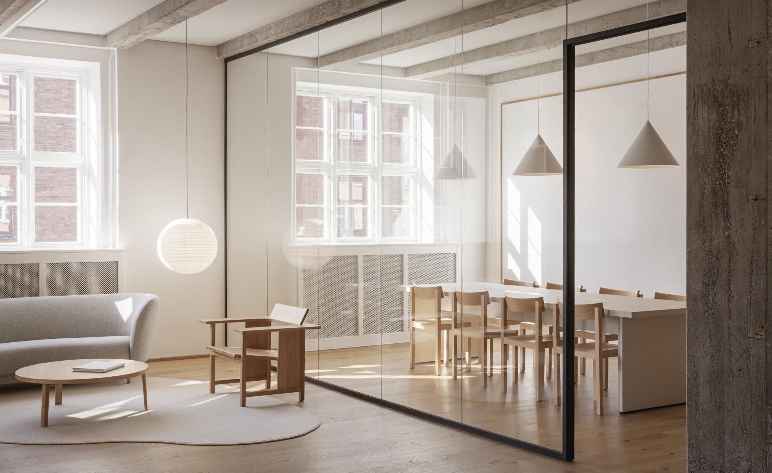
Work & Co, Copenhagen, Denmark
Aspekt Office
Creating a space where ‘employees can feel at home' was a top priority in this office interior redesign by Danish multidisciplinary studio Aspekt Office. The space, for digital company Work & Co, is situated in a century-old building in the Danish capital’s historic city centre. The designers brought the interior into the 21st century by working with its bare bones and layering natural materials, sharp, contemporary lines and a Scandinavian sensibility. Features range from communal meeting areas to private booths and a generous, shared kitchen. Oak wood and soft textiles take centre stage to wrap this inviting interior in homely comfort.
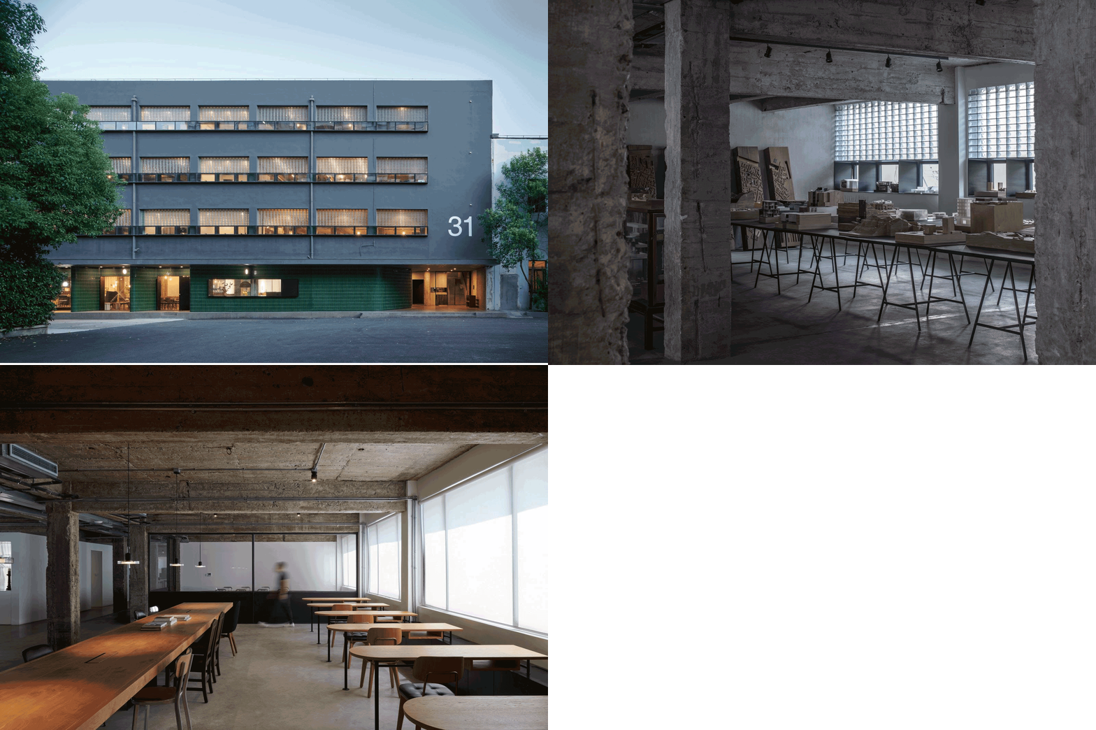
No 31, Shanghai, China
Neri&Hu
Neri&Hu and Design Republic's new home is an imaginative, adaptive reuse of an existing commercial building in Shanghai. The famed Chinese architecture and design office is an expert at bringing existing architecture back to life, having done so with its previous locations. Its latest base sits within a small complex of ex-industrial buildings in the bustling Jing'an Temple area. Avoiding major structural alterations, the team reworked proportions and treatments, adding key elements inside and out, such as glass-brick surfaces and a black metal window frame. As a result, the exterior feels sophisticated and updated. Inside, the existing concrete post and beam frame was left intact and exposed, creating a rough, industrial feel. Sleek, modern ‘pods' were added within where necessary to create different types of space, such as meeting areas.
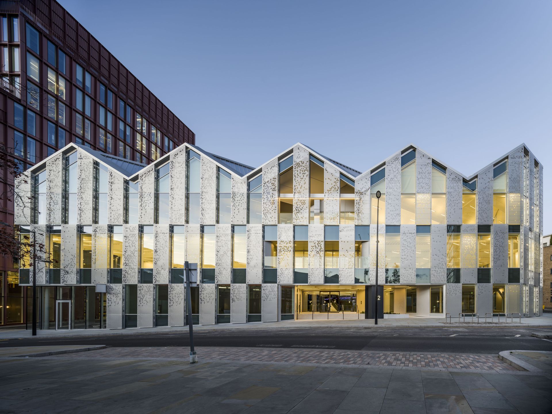
22 Handyside Street, London, UK
Coffey Architects
The latest addition at London's King’s Cross area is an angular office building by Coffey Architects. The structure sits at 22 Handyside Street and is a luminous and generous 36,000 sq ft building; yet its cleverly composed form and broken-down volumes and façade articulation make it feel boutique. These elements were designed to follow the movement of the sun throughout the day. The eco-conscious office design now aims for BREEAM Outstanding certification. The three-storey building is a lightweight concrete and steel composition featuring large windows. The façade also includes surfaces of embossed and perforated anodised aluminium panels that create a translucent effect, adding colour and texture.
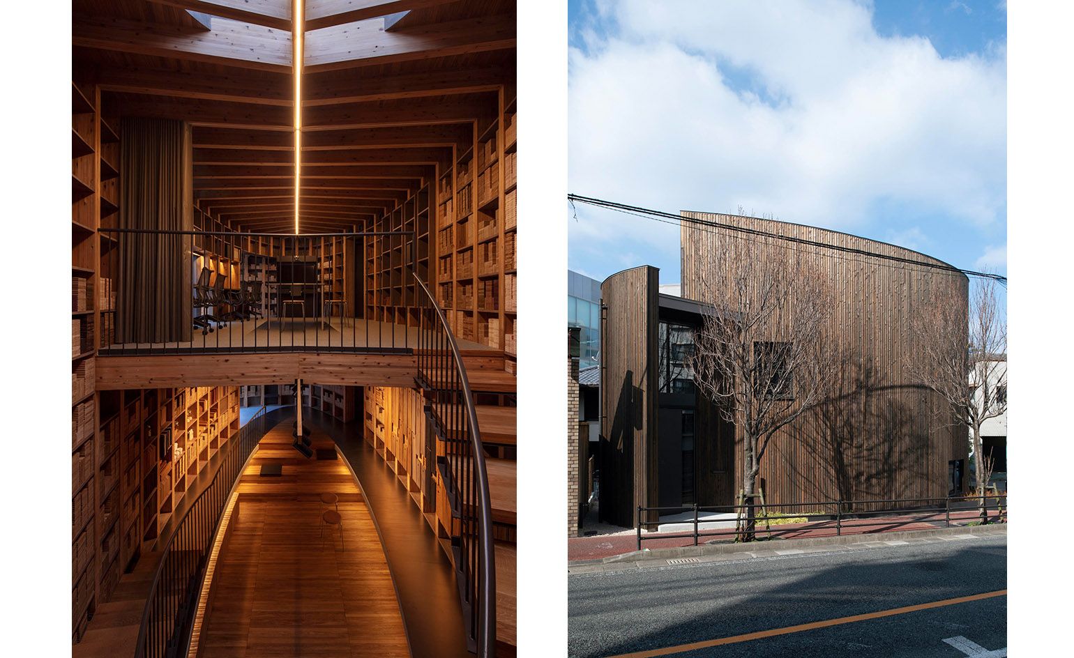
Maruhon, Fukuoka, Japan
Takenori Katori / Katori archi+design associates
Maruhon, a Japanese manufacturer of natural wood for interiors, has just unveiled its latest office and showroom, designed by architect Takenori Katori and his Tokyo-based team. The project, located in a verdant part of the city of Fukuoka, makes the most of its client's expertise to create a fascinating timber structure that elegantly showcases what wood construction can achieve. Inside, working with skilled, experienced carpenters, the architect composed a striking, double-height library displaying over 400 sample boards. A two-storey atrium at the building's heart helps the users orientate themselves and leads to the various parts of the boutique, 70 sq m structure. The exterior is clad in Japanese cedar planks that have been stained with natural plant dyes. The sensitive design recieved full certification from the Forest Stewardship Council.
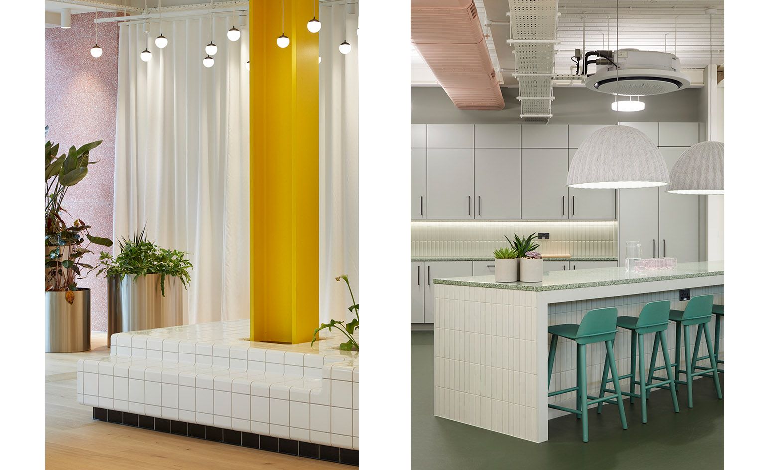
The Panagram, London, UK
Buckley Gray Yeoman
A glazed front leads to an unexpected colourful reception area in this renovation of a tired 1980s office interior in London's Clerkenwell. Designed by architects Buckley Gray Yeoman, The Panagram is a workspace interior that was conceived to offer a twist to conventional office design. Here, graphic tile grids and brightly painted architectural elements (such as the primary yellow column in the entrance foyer) meet colourful lifts and curtains, terrazzo, bespoke quirky wooden details and lots of planting. Different zones within the building (for instance, private versus communal, co-working versus quiet areas) are clearly marked by differences in colour or material. There is even a highly customised wooden staircase with a tree growing out of it.
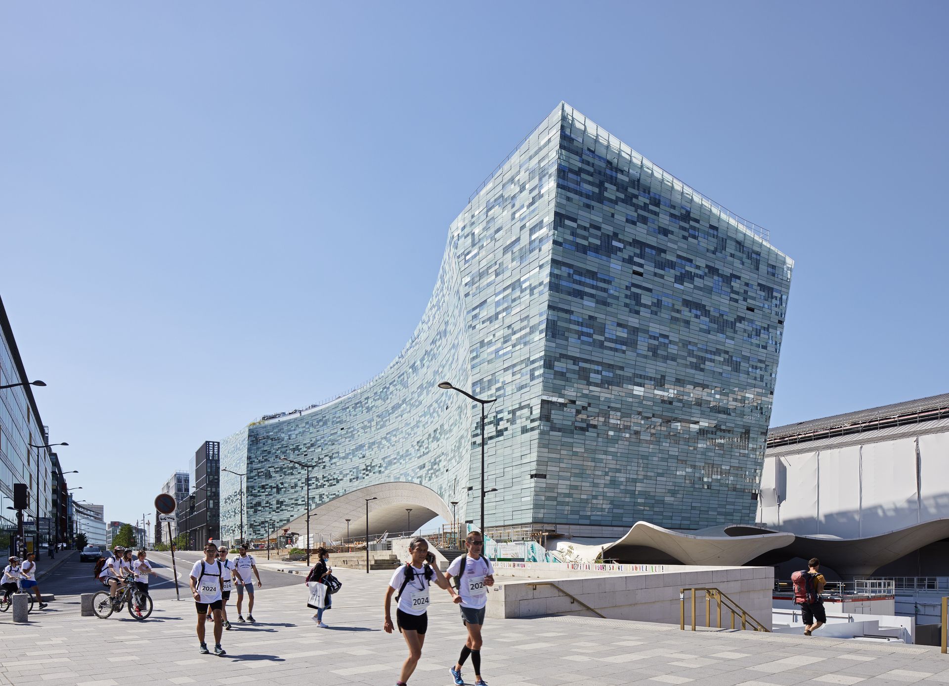
Le Monde Group HQ, Paris, France
Snøhetta
Bringing the 1,600 or so employees of Le Monde Group under a single roof, this new headquarters in Paris was designed by celebrated international architects Snøhetta. The bold, architecturally dynamic building is defined by its sleek façade (made of 20,000 pixelated glass elements) and undulating form that brings to mind an abstract bridge, creating a new plaza underneath it. While improving urban connections around it and adding to the public space, the structure is also sustainably minded, ensuring maximum natural ventilation and lighting is possible. Inside, it includes all-mod-cons needed for a 21st-century office, such as flexible workspace and break areas for staff, two auditoriums, and a planted roof terrace.
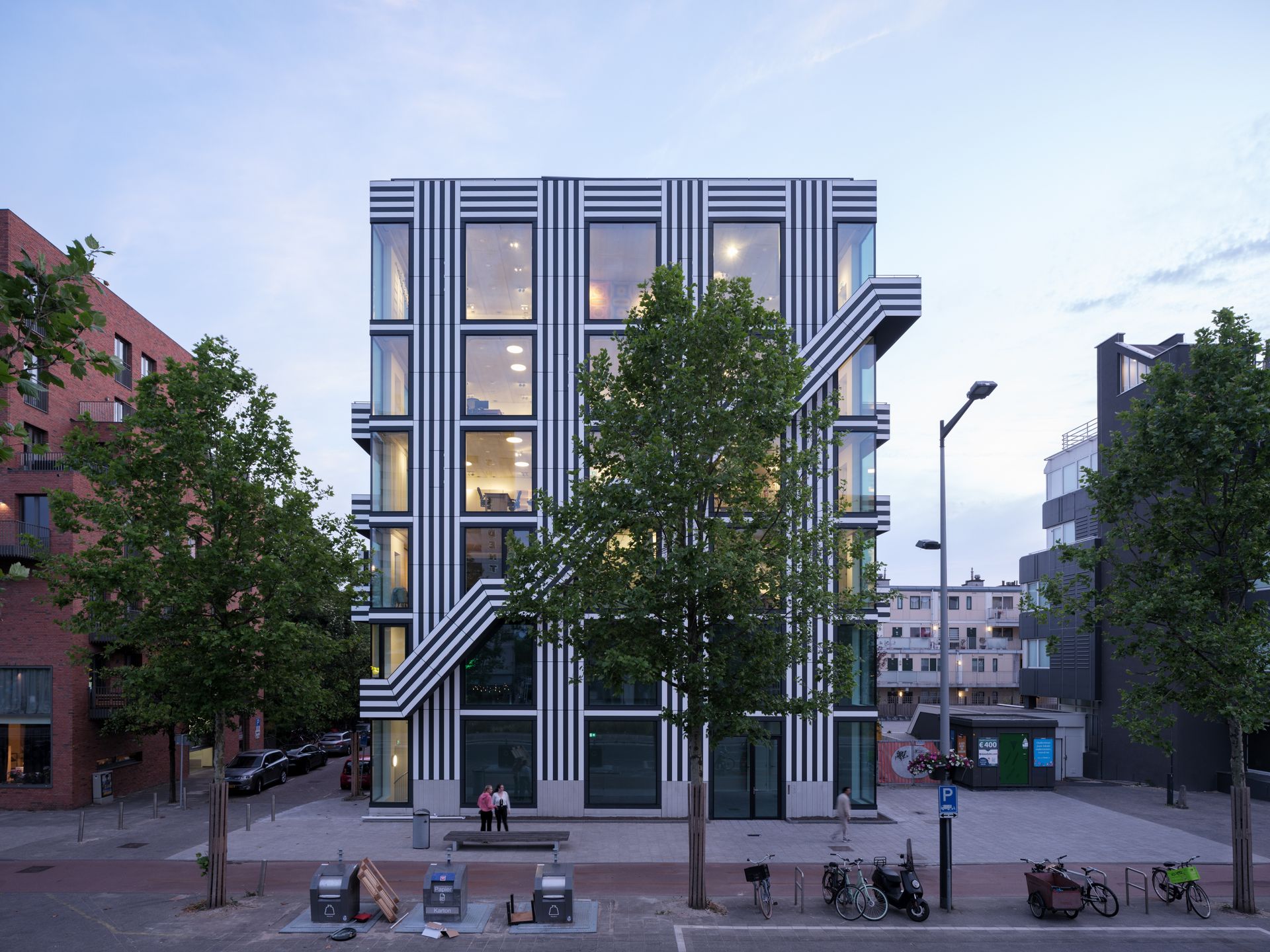
Thonik HQ, Amsterdam, The Netherlands
Thonik, MMX Architects
Graphic design studio Thonik has unveiled a new, custom-made office building in Amsterdam, created in collaboration with MMX Architects. The result is a highly graphic six-storey building on the city centre’s only post-war urban boulevard – the Wibautstraat. Three floors are dedicated to the practice, two to a high-end omakase restaurant and sake bar that draws you in at ground level, and the top floor (and rooftop) is soon to become an events and discussion space. The most striking thing about the building is the combination of floor-to-ceiling windows that bring the city in and open up the interiors, and the façade’s stripes – the effect is dazzling, but it’s also radical in its simplicity and highly detailed and elegant in its execution.
Additional writing: Giovanna Dunmall
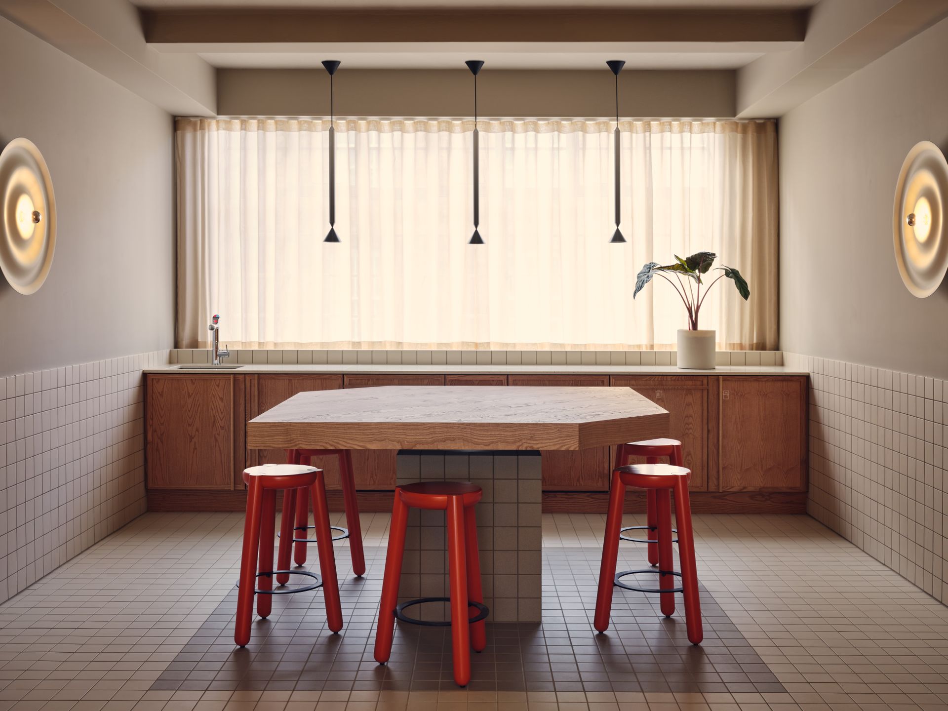
Douglas House, London, UK
Note Design Group
The latest space of TOG (The Office Group), Douglas House, has launched with interiors by Note Design Studio. The new six-floor office building on Great Titchfield Street in London is filled with personality, and uses its bold design to make a difference to the work experience of its users. Note refreshed the existing 1930s structure by creating a series of surprises within, defining different areas through colour and design gestures, underpinned by the studio’s contemporary, clean aesthetic. An undulating glass-block wall runs the entire length of the ground floor. Elsewhere, warm, natural materials mix with statement primary colours in compositions that are eye-catching but not too distracting.
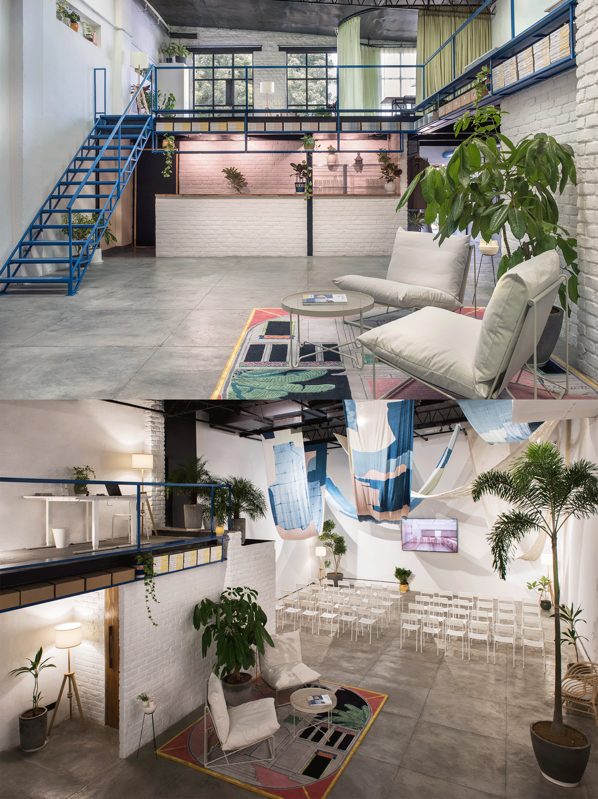
SPACE10, Delhi, India
Kevin Curran, programme lead, SPACE10
The sustainability-focused design and research practice responsible for fascinating collaborations with Ikea, Barkas, Effekt architects and many more, has opened a research and design lab in south Delhi. Designed as a public-facing platform for cross-disciplinary creatives to experiment with prototypes, the studio is located inside Chhatarpur's Dhan Mill Compound, a growing hub for emerging design studios, artists and young professionals. Kevin Curran, programme lead at SPACE10, wanted to combine ideas from Scandinavian and Indian design traditions together in the space. He involved local materials and craftsmen in sourcing materials and furnishing – for example, plant pots were handmade 200m from the space and ceramic figurines were made by Aman Khanna from Claymen, whose workshop and gallery is 50m away. Curran also brought a slice of the Copenhagen HQ with them, by painting the staircase in the same bright blue. SPACE10 has previously popped up in New York, London, Shanghai and Nairobi.
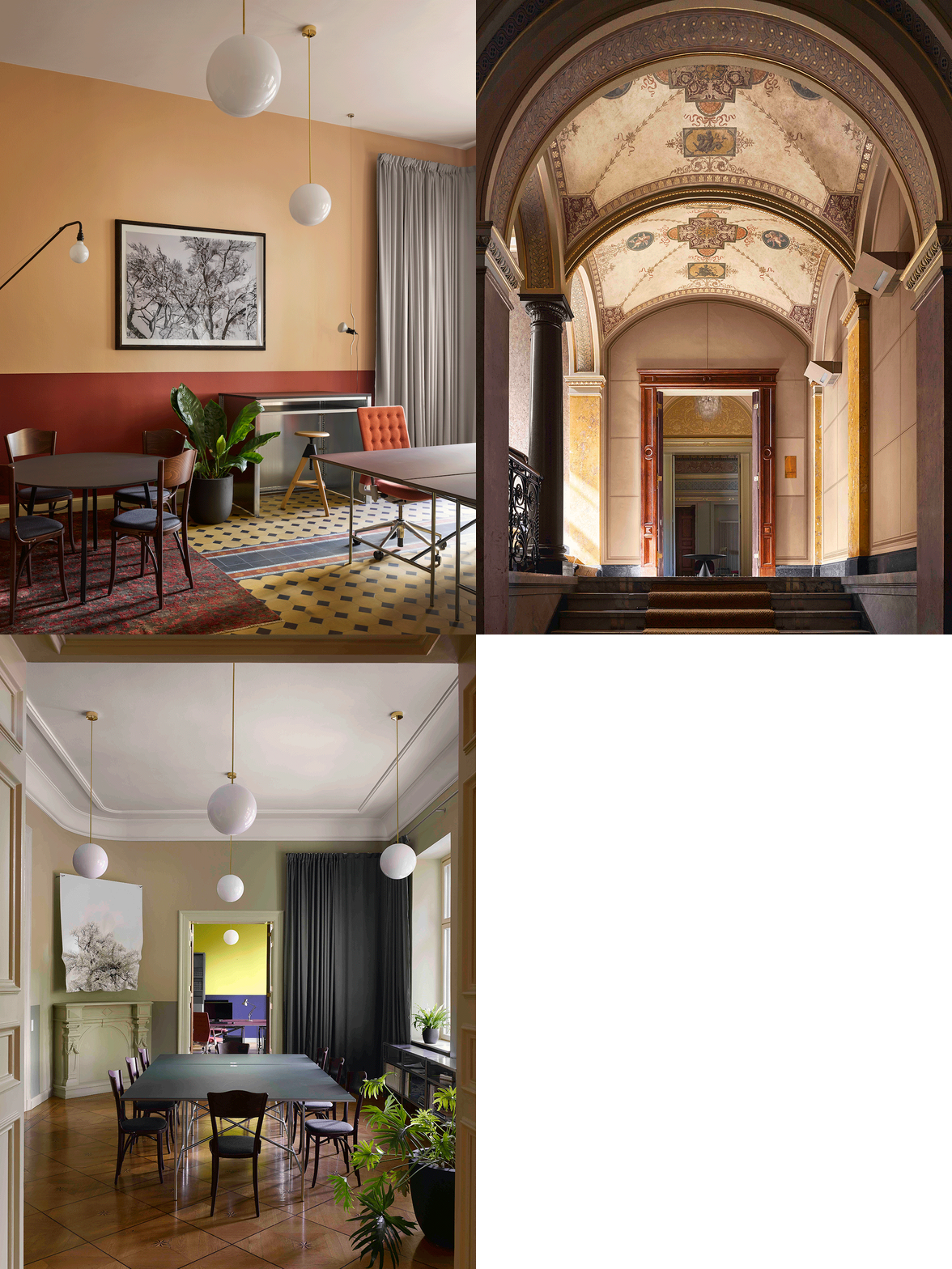
Euroboden, Berlin, Germany
David Kohn Architects
David Kohn Architects (DKA), working in collaboration with Nord Studio, has converted a listed Belle Époque interior into a new office for developer Euroboden. Located at Tempelhofer Ufer, the office inhabits the principal floor of the landmark Palais Eger built in 1881, a grand villa designed for a wealthy timber merchant featuring high ceilings, timber panelled walls and marquetry floors. Within these decorative spaces, the architects added colour, new materials such as Marmoreal (a nougat like engineered marble designed by Max Lamb for Dzek) as well as contemporary furniture. Inspired by Sir John Soane’s house museum in London, DKA wanted to capture an air of ‘productive domesticity’, where both work and cultural events could play out.
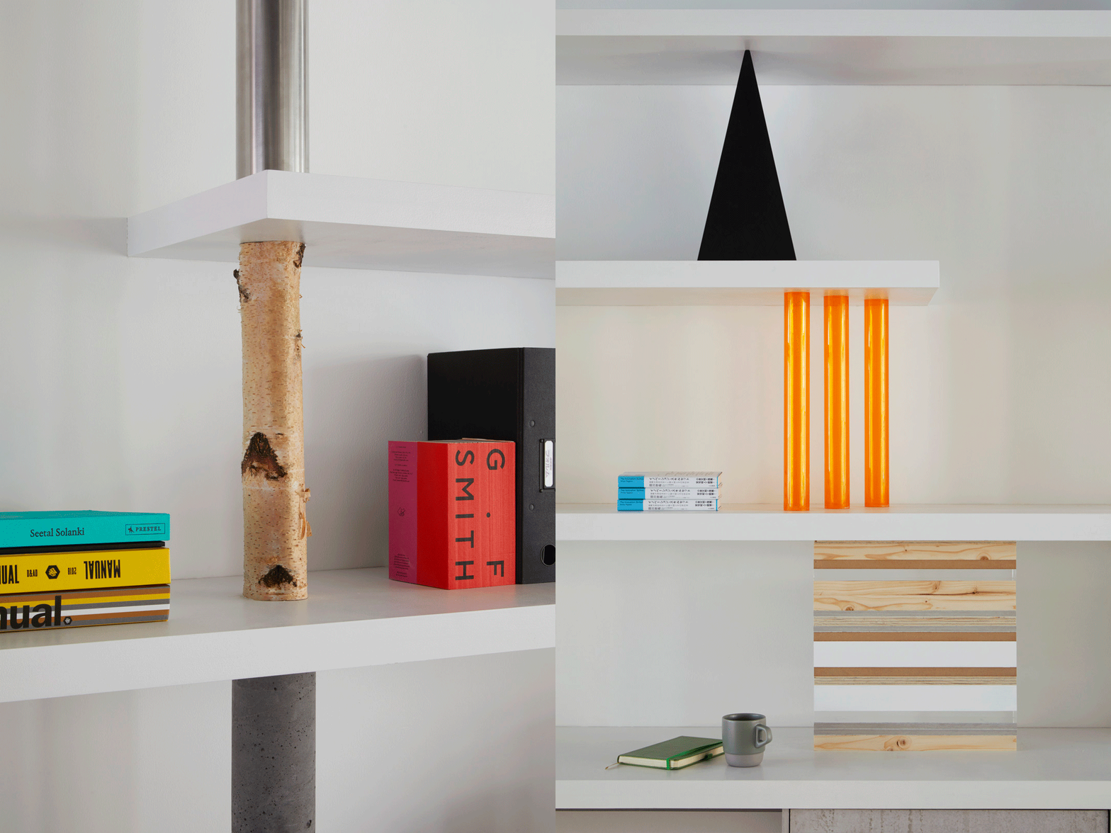
Takram, London, UK
Sam Jacob
For design innovation studio Takram’s London outpost, Sam Jacob Studio has created a ‘raw yet refined’ space defined by a composition of frameworks and armatures acting as workspace, storage and partitions. White horizontal planks are supported by a series of objects and material fragments assembled through a method of stacking and piling. The result forms a material library of textures and shapes – cement board sits alongside marble panels, concrete next to timber, orange tinted acrylic tubes and reflective chromed pipe. Meanwhile powder coated steel frames create a skeleton of a kitchen and workshop space, and are also used for custom furniture such as the long main office table. As an international design studio, we value ‘collective openness’ and celebrate different viewpoints and skillsets – we wanted to reflect this into space through material usage,’ says Yosuke Ushigome of Takram.
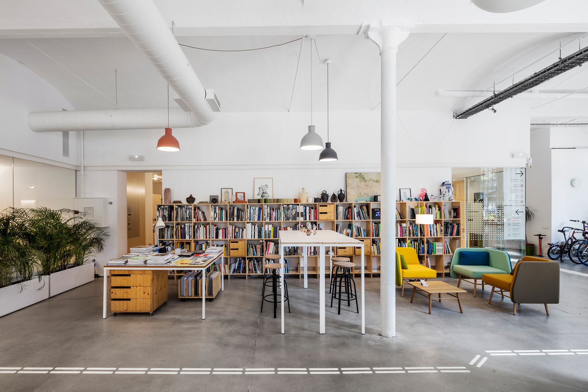
PMMT architects Barcelona office, Spain
PMMT
In an industrial building, previously a biscuit factory, Spanish architecture firm PMMT has designed itself a new office that reflects its core values of inclusion and health. Putting the comfort and creativity of its employees first, the atmosphere of the space is uplifting and bright with linoleum flooring, ergonomic furnishing and plenty of vegetation. The office space includes areas specially designed for ‘forward thinking’ and ‘brainstorming’ featuring moveable walls and panels for flexible collaboration.
Ellie Stathaki is the Architecture Editor at Wallpaper*. She trained as an architect at the Aristotle University of Thessaloniki in Greece and studied architectural history at the Bartlett in London. Now an established journalist, she has been a member of the Wallpaper* team since 2006, visiting buildings across the globe and interviewing leading architects such as Tadao Ando and Rem Koolhaas. Ellie has also taken part in judging panels, moderated events, curated shows and contributed in books, such as The Contemporary House (Thames & Hudson, 2018) and Glenn Sestig Architecture Diary (2020).
-
 How to live fabulously: Ash Staging creates colourful house interior in LA
Ash Staging pays tribute to the 1990s with this Los Angeles home interior, featuring breathtaking views and filled with contemporary pieces and vintage design icons
By Pei-Ru Keh • Published
-
 Hangover recovery kit for the holiday season
From liver-saving drops to vegan Berocca, our hangover recovery kit has everything you need for the party season
By Mary Cleary • Published
-
 Diamonds form undulating waves in Marie Mas’ high jewellery
Jewellery collection ‘Luminous Lines’ by Marie Mas brings a fluidity to high jewellery
By Hannah Silver • Published
